My neice works for this company and ask me to rework their business card. They are opening a new location and needed to upgrade their card to reflect that. At the same time, they wanted a new look.
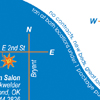
I started with the back of the card and mimicked the map style of their current card. In order to differentiate the two locations I used an ‘s’ curve and inverted the images on one side.
After finishing the back I noticed that the curve reminded me of the curve from the waist to the hip of a woman. I found an istock image of a nicely tanned woman reclining on her side wearing a red bikini. Some judicious cropping gave me the perfect (pun intended) backdrop for the company’s logo (I did not create the logo) and the additional text they had requested. I chose to make the text appear to be written on the woman’s body in “untanned” skin to both show that she is tan, but not too tan, and because of the little shapes people sometimes put on themselves prior to tanning to produce a inverted image.
Specs:
Blue – Pantone 285
Orange – Pantone 165
Yellow – Pantone 394


