

My good friend’s son has lawn service business. He ask me to help him create a logo that would identify his brand. He already had the name and was playing around with a trophy rack (as in deer antlers) for an image. The first thing that came to me was that we could play off the rack’s similarity to tree branches. It took some adjusting, but I eventually created a tree with branches that were deer antlers and enough leaves to make the tree but not so many as to obscure the antler look.
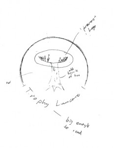 We played around with how to incorporate the lettering and after several attempts he drew a circle with the antler tree in the middle and wrote the words on the circle at the bottom and said, “Like a seal”. That gave me enough direction to decide to mimic the thickness of the lettering and create a match for the text with a top and bottom line in a circle. The letters drop out the circles (the ends of the circles match the end of all the letter forms) at twice the spacing of the tree form cutouts. This made the text easier to read and created a nice visual weight balance.
I used the font “License Plate” because it has a very clean and even letterform and is tall and narrow. This gave me the ability to put all the text in the space below the “antlers.”
The green is Pantone 367C and the Brown is Pantone 161C. The design needed to be brown and green to enhance the tree effect of the antlers. However, it is also the case that the client loves camo and outdoors stuff and these colors will coordinate well with that. The green and brown are brighter and a little more “electric” than the browns and greens in camo, so the logo should show fine even on camo print.
The client said (and I quote) “sweet.”