I used to do a lot of shirt designs. These days I do a lot less. But I still enjoy it and every once in a while I get the chance.
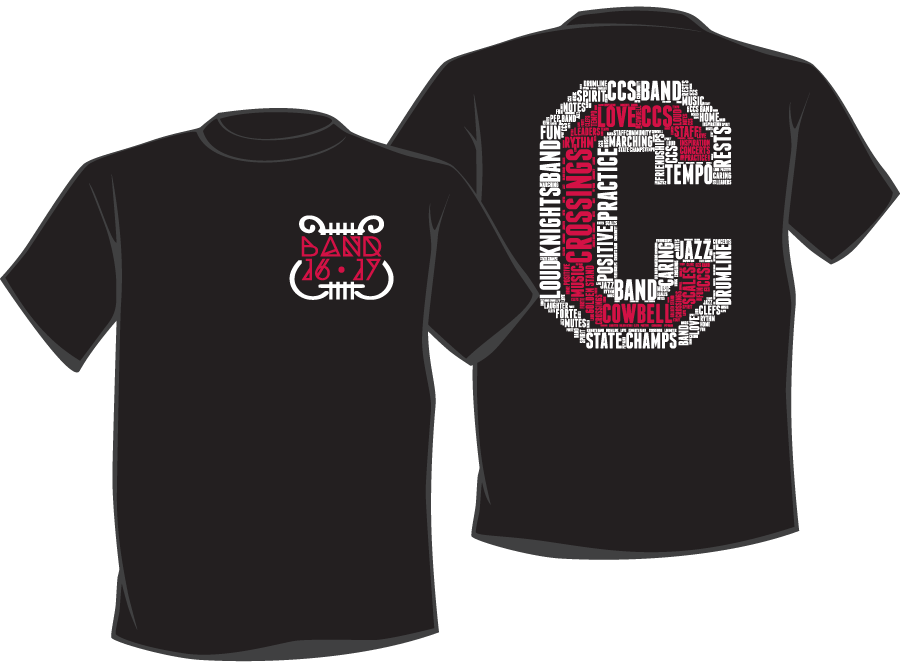
My daughter is in band at her high school. She came to me for a design for this years band shirt. She had a pin of a font they wanted to use on a pocket design for the front and they wanted a big “C” on the back in a varsity/letterman type. That was it.
I like these kind of design gigs. Something to start with, but not a complete concept that I have to follow. I don’t really like to be just a graphic artist. I like to create the design.
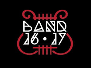 First I found the font, Dia, and got a copy of that. Then I found there are no numbers in the font. So…I created the 1, 6, and 7 I would need to do a “16 – 17” on the shirt. Just the letters “BAND” and “16 – 17” seemed a little sparse, so I pulled up images of the music holder that looks like a harp (lyre actually) and find it is called a lyre, go figure. I found a simple version to use as a template and then created a simple vector outline that compared well with the weight of the font. I blocked the lyre out to make the font readable and the front pocket design was done.
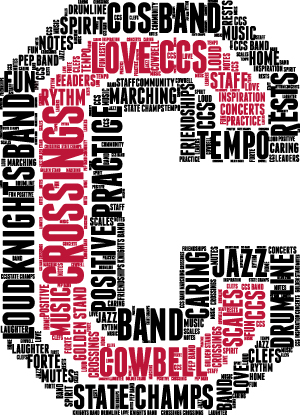
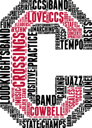
 I thought the “C” on the back was a cool idea, but something had to create interest and motion for it to really work. Word Cloud! I have used an online word cloud generator in the past (Coalescing My Indentity) and I could see that concept in my head. I created a black and red “C” and uploaded it to the Word Cloud generator. I took the output of that and imported into AI and started changing things. The generator is a little sloppy in the way it spaces words and I don’t like the tiny words it puts between the letters in the big words. Overall, it is a good starting point, but it took a lot of tweeking to get what I was looking for.
|
|
|
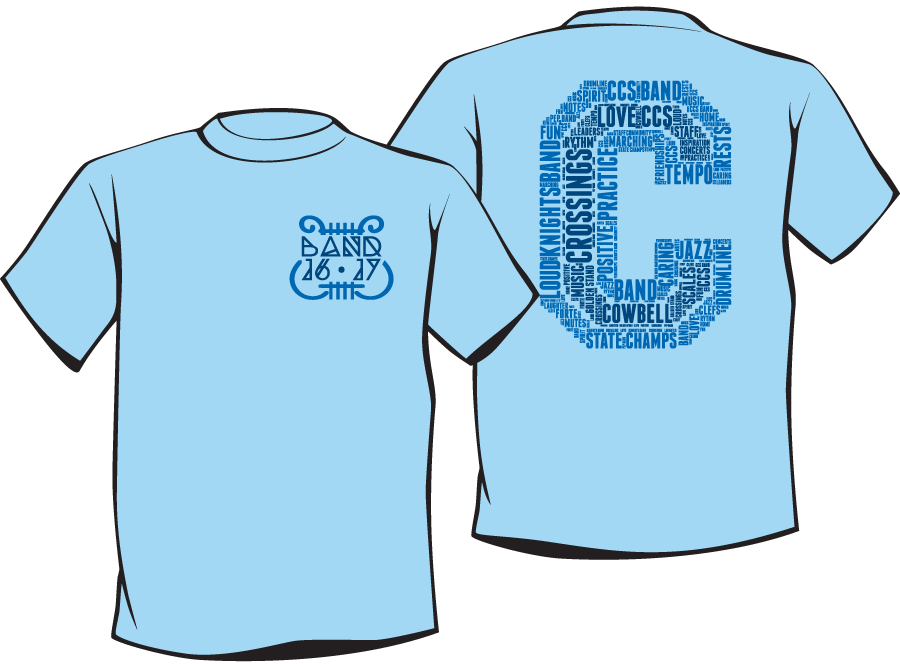
So far I was designing in red, black and white as those are the school colors. Then my daughter sent me a text indicating that they were thinking about blues:
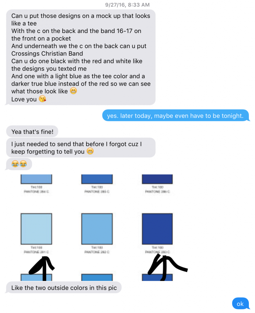
The great thing about designing in vector and keeping your layers and groups organized is you can change colors in about a second. A quick selection and color change later I had the two mock-ups she needed: