
My son asked me to do a logo for a group of his (music I believe). The name is Grilled Cheese Collective. He gave me the following:
“Grilled Cheese Collective”
“grilled cheese cut diagonal”
“simple colors, i.e. yellow, blue, purple”
I love this kind of work!
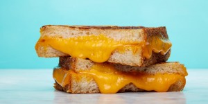
I started with a photo of a sandwich I liked:
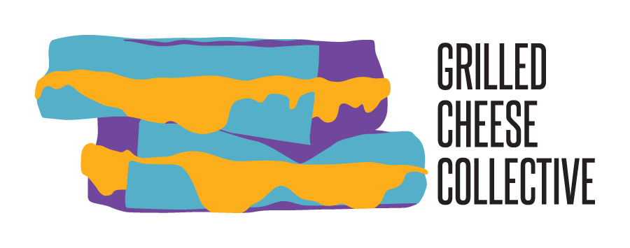
and then created a vector outline in AI that looked good to me. Since my son had given me 3 colors he wanted and one was “cheese” colored, I used the purple and blue as dark and lighter bread.
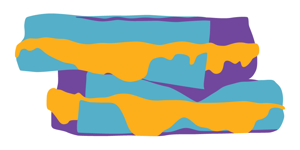
When I showed him the initial design he said, “that’s dope”, which I think means good. We played with the colors a bit before we settled on Cheese Gold (0,35,99,0), Bread Blue (64,14,16,0) and Crust Purple (68,86,0,0).
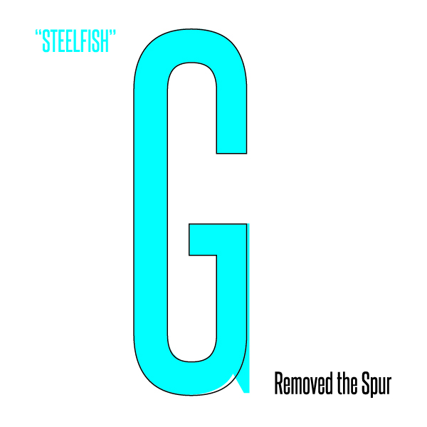
Next we needed to put the Grilled Cheese Collective text into the design. We went through several fonts and kept picking clean, solid almost formal sans serif fonts. The design kind of requires a condensed font and Steelfish ended up being the choice. The one problem with Steelfish was the capital “G”. The spur doesn’t really match the clean lines of the other capital letters, so I changed it:
Then we played with placement and decided on two options:
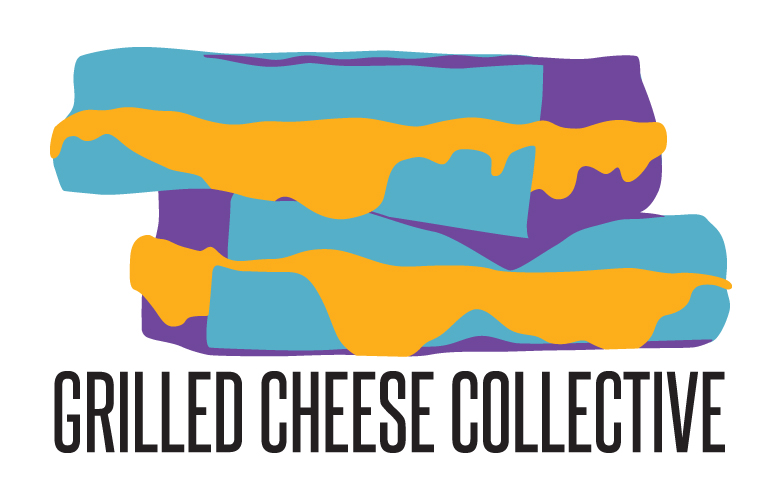
This turned out to be a really good design. I’m sorry, a really “dope” design.