A good friend of mine asked me if I knew anyone who could redraw a business logo for his boss. All they had was the small low res file being used to order biz cards online and they needed letterhead, signage, and other options. I said, “me…”
He sent me a pic of the business card:
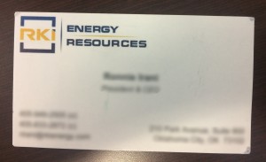
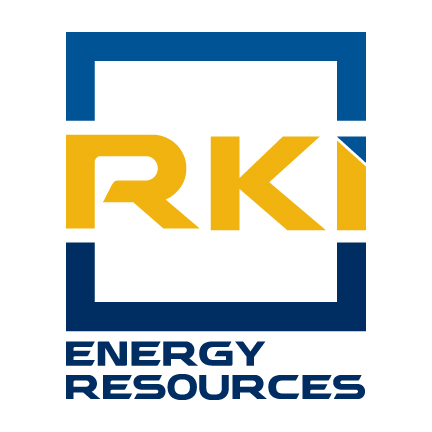
My initial thought was to improve the balance of the logo and clean it up by removing the triangular dot in the “I”. Looking closely at the “K” I noticed the font had an odd arm that got wider as it went out, so I needed a knew font form too.
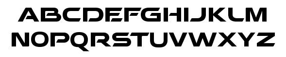
After some research, I selected Behatrice for the base font.
I really liked the way the bar and leg of the “R” were separated, keeping the original feel of the logo, but with more definition. I didn’t like the “E” being separated, but that was an easy fix, and as with all fonts “used as logos” I would have to adjust kerning:
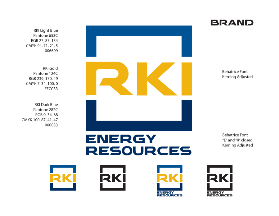
I like that the three horizontal sections are visually balanced. The spacing between the blue borders and the lettering is 1/2 the width of the border. After consultation with the client, I adjusted the colors some to settle on these final choices. I don’t like the text below the logo, but the client insisted. I offered an version with just the “ENERGY” below which looked better, but it didn’t fly.
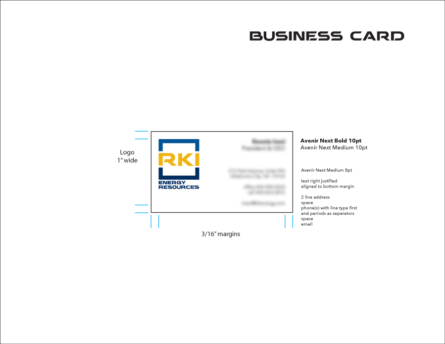
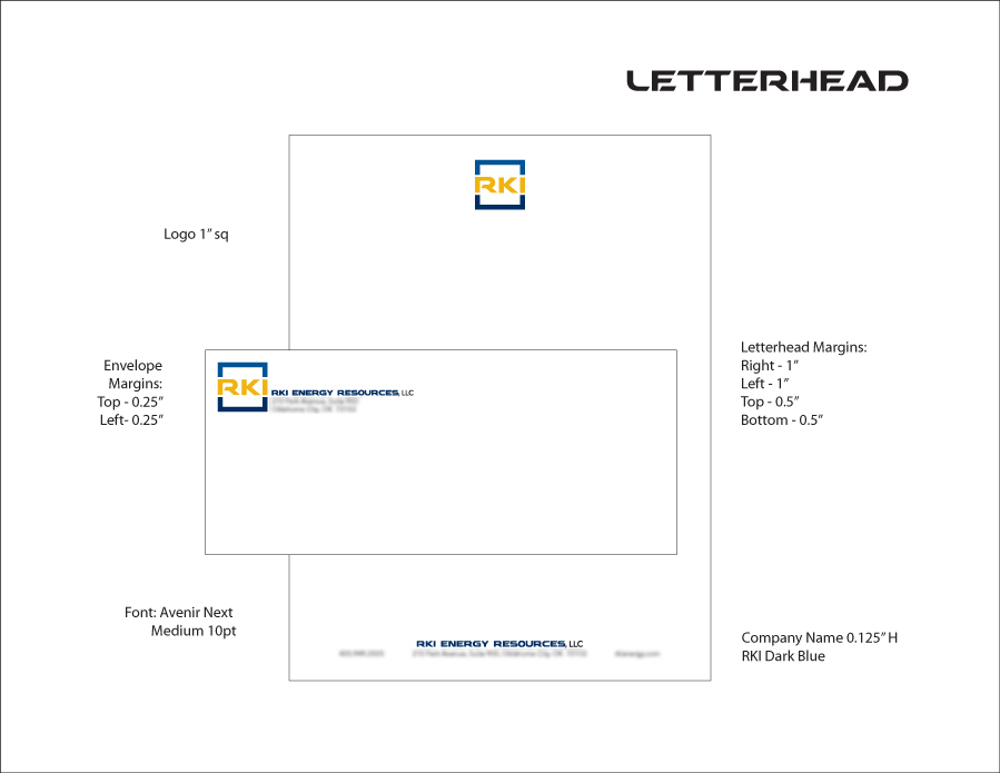
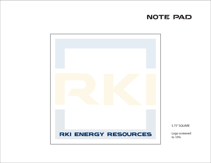
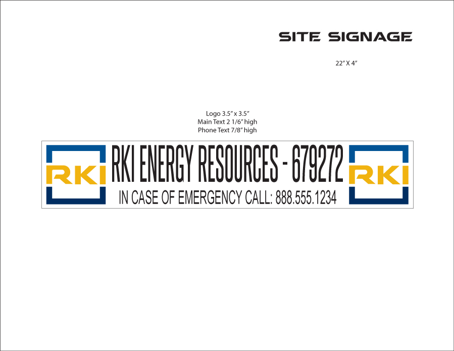
Then on to stationary and other uses:
At the end of the day, the customer is right. One reason I don’t do design work for pay is I don’t want to be forced to produce designs I am not excited about. I choose the projects I work on and the people I work with carefully so I don’t find myself spending too much energy convincing someone that the design I am offering is the best option.
In this case, the client decided that the “wedge”, as he calls it, was “lodged” in his brain and had become part of his company identity. He wanted it put back in. So I put it back in.