Menu
Skip to content
Home
Misc
T3
LAMY
Logos
Pirana Bros
CCS
GOK
Genealogy
About
Silent But Deadly
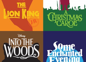
No Life Without Drama
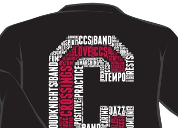
A Band of Brothers and Sisters
CCS Senior Funny Money
CCS Style Guide
Crossings Christian School Logo
Percival the Knight
CCS Media Files