
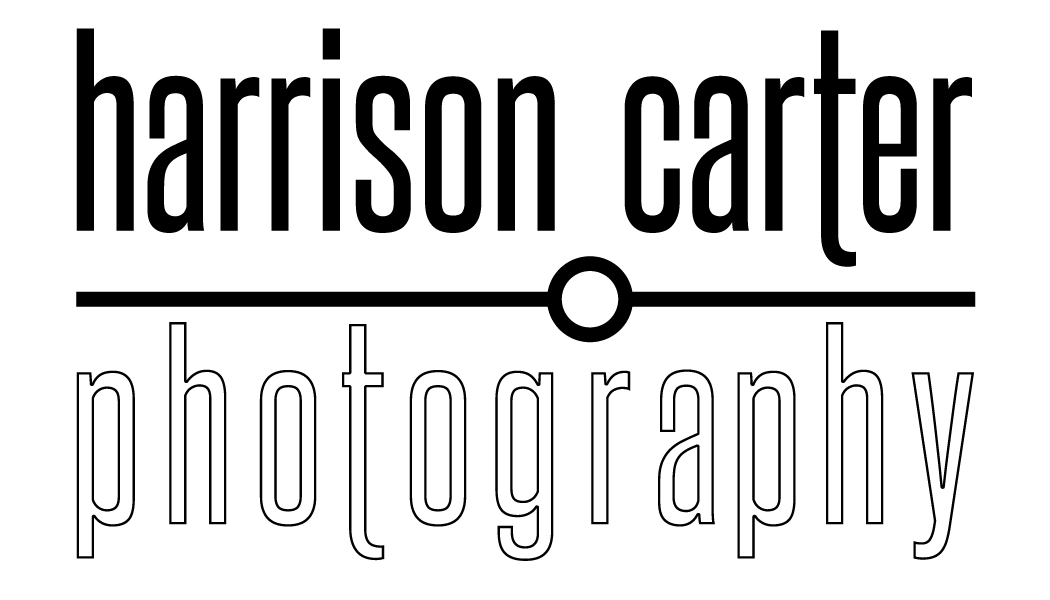
I have already posted about creating a “Mark” for my son, Harrison, and he intially thought he would use that mark as the watermark for his digital photography. As he has increased his customer base and noticed other people that do photography, he decided he needed a better mark for his business.
 He uses his middle name for his business and after some discussion he decided he didn’t really want a graphic that was traditionally associated with photography or cameras.
We started playing with clean slender fonts and stacking the text and went through several iterations to come up with the final form.
The font started as “Steelfish” but I adjusted the bottom of the “t” down to hang with the other descenders. There is also some kerning adjustments to create the length needed in “photography” to match the top text.
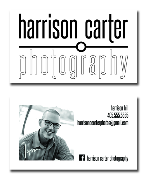
While his primary use of this will be a watermark for his digital proofs, I designed with the idea of business cards in mind. On a standard 3.5×2 card, the right and left edges can be placed at .25″ margins and the main body of the text top and bottom fall at .25″ also. The descenders and ascenders cross into the margin area, but visually the mass falls inside the margins.
Having a full coverage front image means putting contact info on the back. This gave room for a photo of the artist, helping people put a face with the product and leading to better name recognition.