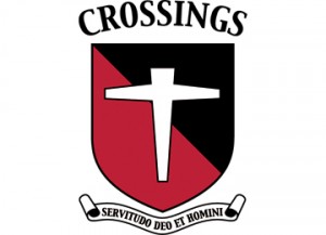
My children attend Crossings Christian School (all 6 of them) and my oldest son was one of the first students in the first class. As the school grew and eventually moved to a larger location, I was approached to design a new logo for the school. There was already a cross element associated with the school, so keeping that, I began to gather elements that would represent the school’s values and heritage. I had in mind to create a simple, iconic logo that was a modernized version of a classical crest. Researching heraldry I decided on a red (Pantone 200), black and white color pallet: red for strength, black for constancy and white for sincerity and peace. The cross element is an adaptation of the passion cross, the historical symbol of Christianity. I chose a shield with a diagonal division called a ‘bend’ because it signifies defense or protection. I made the cross the only element on the shield to represent our belief that Christ is sufficient for all. The motto for the school had already been determined: “Servitudo Deo et Homini” which means “Service to God and man”
