Pancho is one of my very good friends. During a drive back from Stilly where we had lunch with another friend, he lamented the fact that he had not a logo with which to represent himself.
I offered to help him fix that. I just need something to start with… nothing. “Well, do you want a graphic image logo or a text based icon?” I ask… “I like the text thing I think.” He answers. That’s about all I got from him.
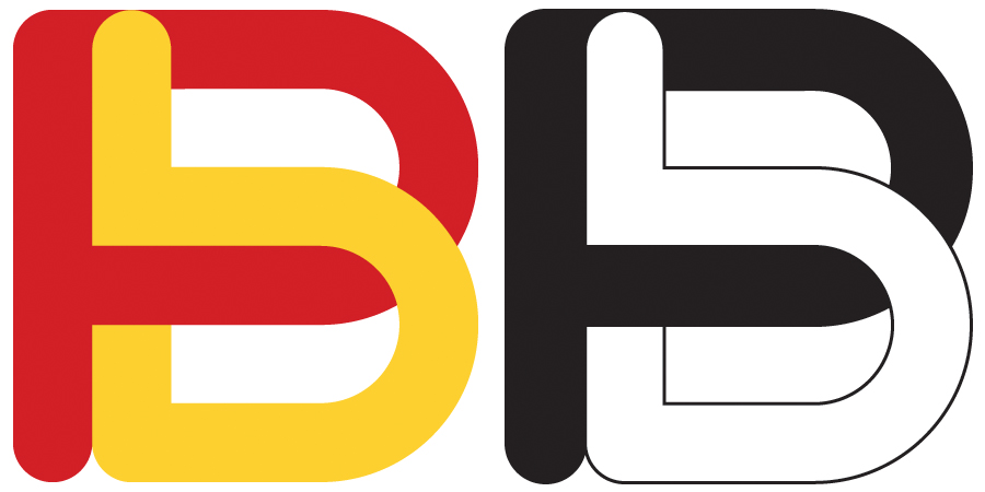
During a conference call I started playing around and about 17 versions down the road I offered him a concept in black & white. I alsways start logo design in B&W because a good logo has to be useable in monochrome. This text message exchange then occurred:
Him: Good, Maybe we need color instead of black and white.
Me: What colors do you like?
Him: Red and Yellow
Me: Red red. Orange red, Maroon. Yellow, Gold, Lemon.
Him: Red red
Me: Ferrari Colors
Him: Yes, Never thought about it that way.
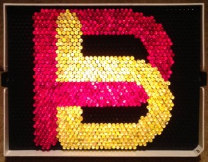
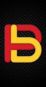
So I used Rosso Corsa (CMYK 10,100,100,3) and Giallo Moderna (CMYK 1,17,91,0), both Ferrari colors from the early years when life was simple and fast cars came from overseas and were yellow or red.
The concept was a simple drawn font using his initials, BP, with the same symbol reflected to make both characters. I intertwined the letters and indexed one to the right and made the whole thing “square” so it would make a good icon as well.
When I ask him how he was going to use it he wanted an iPhone background, so I made a couple of those, but somehow I ended up making a caricature icon from a pic he sent me. Overall it was a really fun project, mostly because I enjoy working on stuff with my friends.