
We are working on a tech startup, and needed a “name” to use for the project until we actually named it. Looking over a list of code words for WWII missions we found Anvil, which was the code word for the invasion of southern France. Cool. So we started using that. When it came time to name the company we are starting we had grown to love Anvil. We added Red and Group and “Red Anvil Group” was born. The group is part of the official name but won’t be used when speaking about the company and we might even drop the red at times and just say “Anvil”. So the logo needed to say that, be strong, and be boldly graphic.
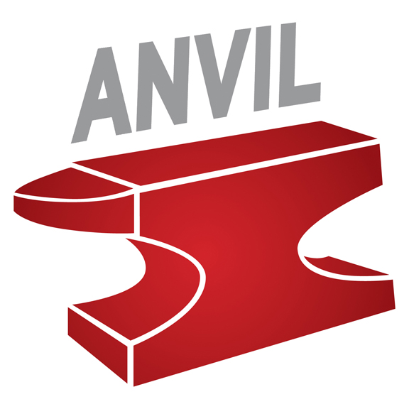
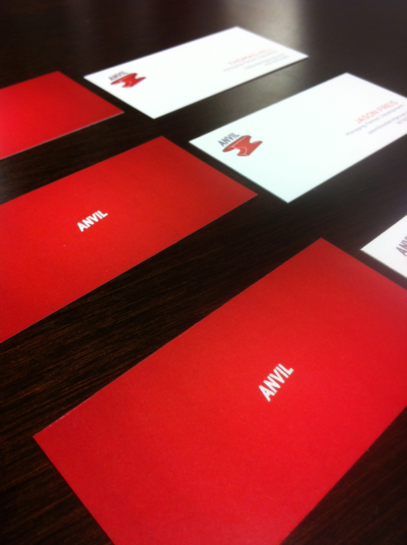
I created the anvil first. I started with a more complex design, but the simpler I made it, the better it looked. The word mark was in a font that had a rounded edge to it originally and the anvil was solid red. One of the principles in the start up is dating a designer, Kimberly Witchey, so we asked her to come up with some biz card ideas. She suggested changing the red to a deeper color and making it a gradient to add some depth and intensity. She also switched the word mark to Cool Grey 7 and on her suggestion I changed the font too. She came up with the card design, which we think rocks!
Here is the progression from first draft to final logo:
