

A friend and I had this conversation:
BP: Do you have any cool looking signature fonts? I know you are the king of fonts
T3: Tons
BP: Here is what I need… over the past few months I have gotten into macro photography and need a neat little simple signature logo type thing for pics
Like this place.. photologo.co ..I have tried to make one in photoshop but can’t get it to look even decent
T3: I need several signatures in black ink on white paper. They can be on the same sheet, but not touching or overlapping each other. If your signature is not readable, i need you to write your name in cursive, several times also. I can make that kind of thing.
BP: If you look at that website, those are not really peoples signature.. it’s a cool font for their signature. That’s what I need. My signature sucks and so does my cursive.
T3: Ok
BP: It even says that’s what they do on their site
T3: I know what they do, I just think original and you is usually better.
BP: It would look horrible.
Two things: First, I am not the king of fonts. I personally think fonts are WAY overused (especially in logo design) and I try to limit my font usage. In logos I almost always edit the fonts I use. Second, about 2 hours later he sent me a scan of his signature.
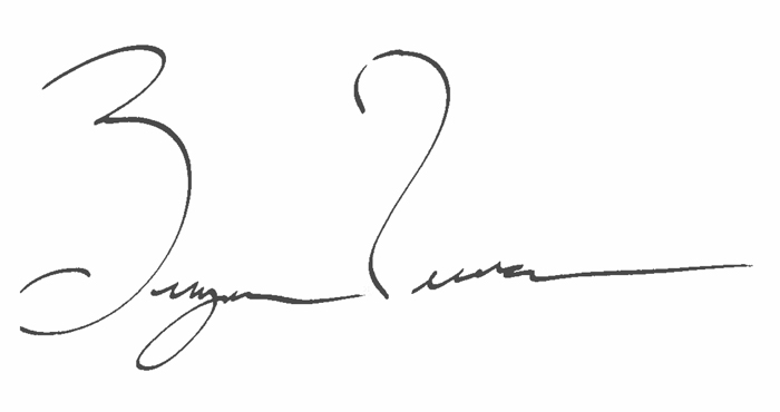
While it is true that his signature is unreadable, it doesn’t suck. In fact, it is very unique and cool. I starting looking for a font I could use for the body of his signature that matched in form the way he sweeps his letters along without really finishing them. I came across Autograf from Måns Grebäck. This is how his signature looks in the font as rendered:

My plan was to create a “B” and a “P” that looked like the font, but matched his signature too. I also decided I would have to rework the “y” to get the sweep of his first name right. He signs his name with a fountain pen (doesn’t everyone?) so there is a little variation between the vertical and horizontal strokes in his real signature, however, the usage of this “photologo” was to ba a watermark on photos and a consistent line weight will render better.
After considerable playing around (I’m picky) I settled on this version:

Adding his name along with PHOTOGRAPHY under the signature ensures that people who see his photos can read and remember who took them.