Author Archives: Thomas Hill

Pete’s

Over the holidays my sons and I (mostly them) got everything running on my MAME Arcade Cabinet. MAME stands for Multiple Arcade Machine Emulator. The software emulates the old computer hardware that played the arcade games and uses copies of the original hex code that was stored on EPROMS on those computer boards.

Buttons, joysticks, spinners, and trackballs are all wired into specialized controller cards that convert those signals into what appears to the emulator as keyboard and mouse signals. When it’s all done correctly you can’t really tell that you are not playing the original game on original hardware.

In the process of getting my cab back in shape, one of my sons decided he would like to build a cab for himself. I always wanted to build a second cab, so I was all in. The first step was to determine what kind (shape) of cab to build. I suggested he consider the old TAITO cab. For one thing, I had one in storage that we could use for measurements and possibly parts, and two, I think it is one of the cleanest and well designed cab shapes. He agreed and we were off to the races.

He wanted an OSU Cowboys theme, but not like my cab. I found some reasonably high res images of the original art for this cabinet, as well as a good set of plans for building one.
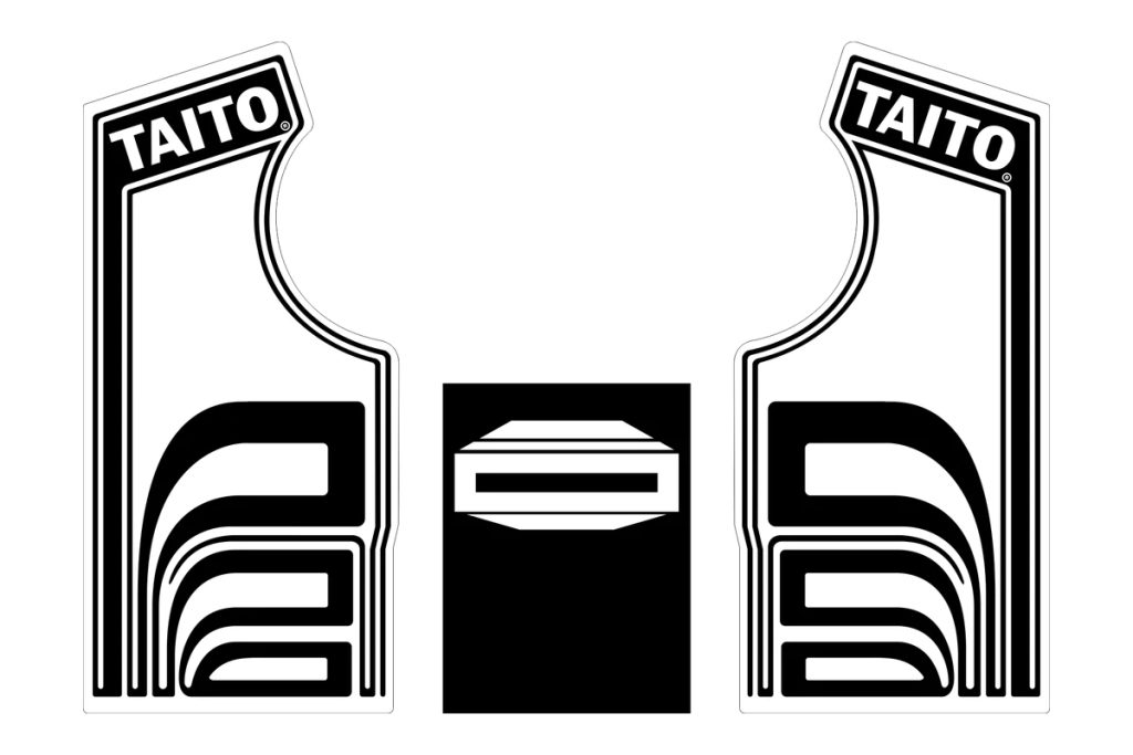
I digitized the side art and used that as a starting point for the design:
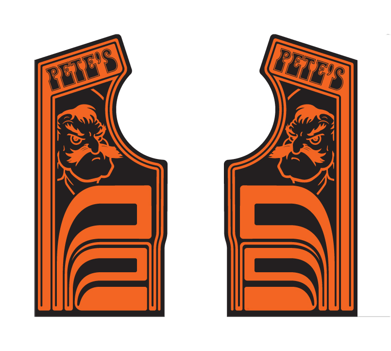
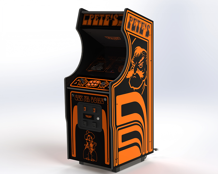
While I was working on graphics, my son was busy modeling the entire cabinet (including every bolt and nut) in Solidworks for we would have a model:
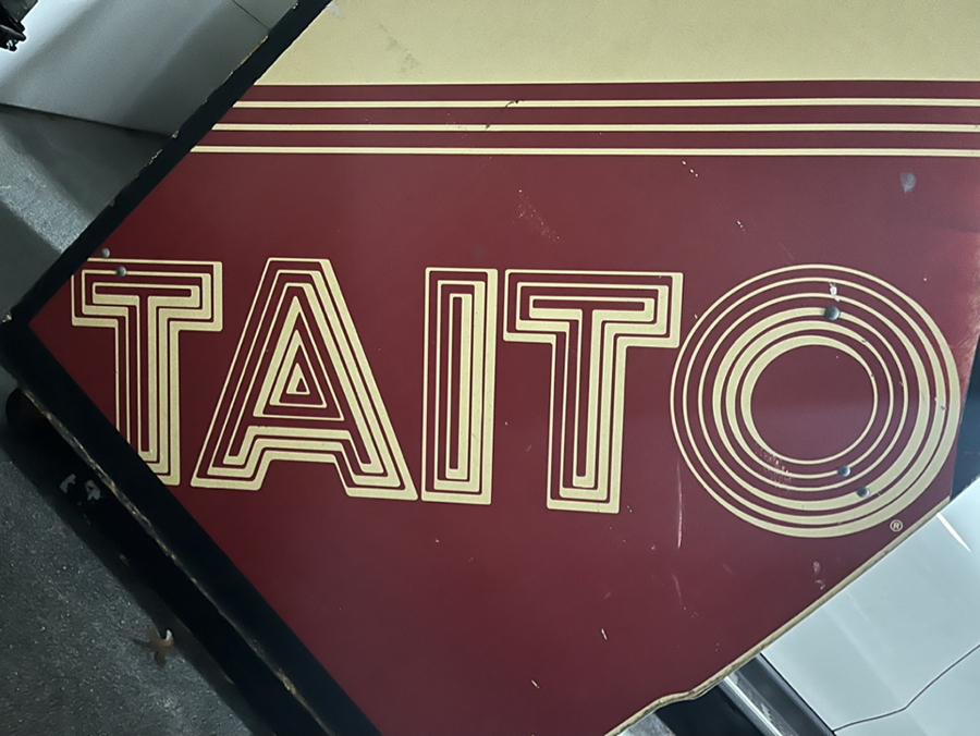
Along the way I also digitized the TAITO logo and a graphic from another cab for use in the Attract Mode Screen. This was the pic I got off the cab:
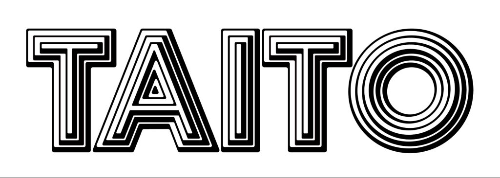
And the Redrawn art:
I also took the TAITO Logo:
And made it a “PETES” logo:
And then used those elements on the Attract Mode screen:
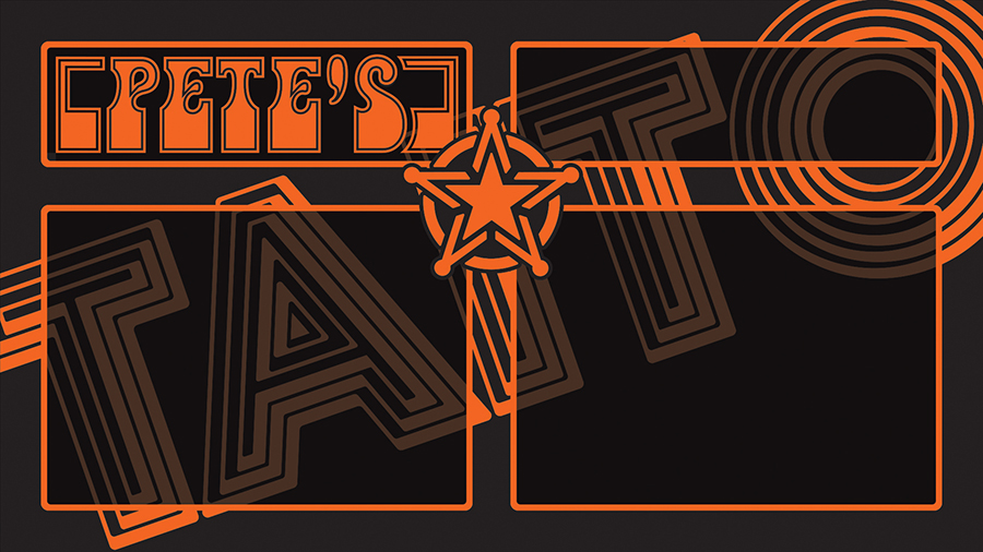
And the Marquee:

Poking The Cowboys

I recently posted about a graphic design error in the University of Houston’s interlocking UH logo. Lest you think I am biased and ignore problems in my own backyard:

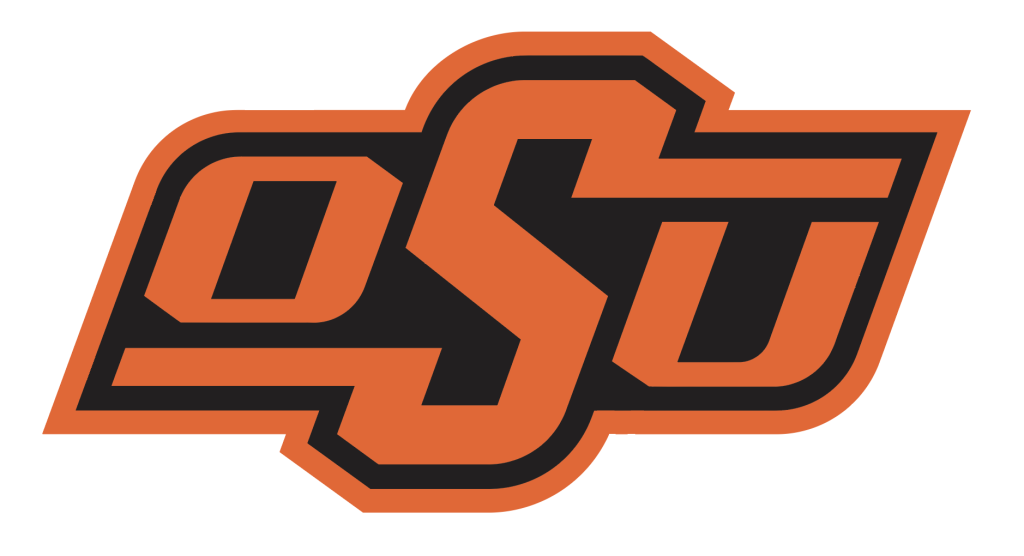
There is a problem with the Oklahoma State University logo too. Here is the official logo:

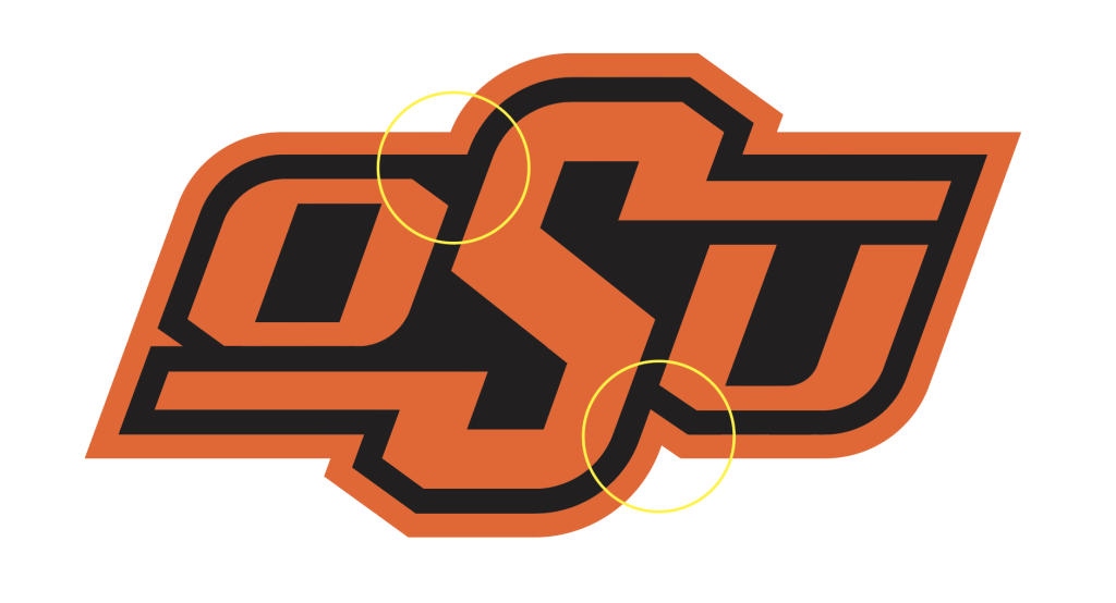
Notice the difference in the treatment of the path offset between the two circled areas:

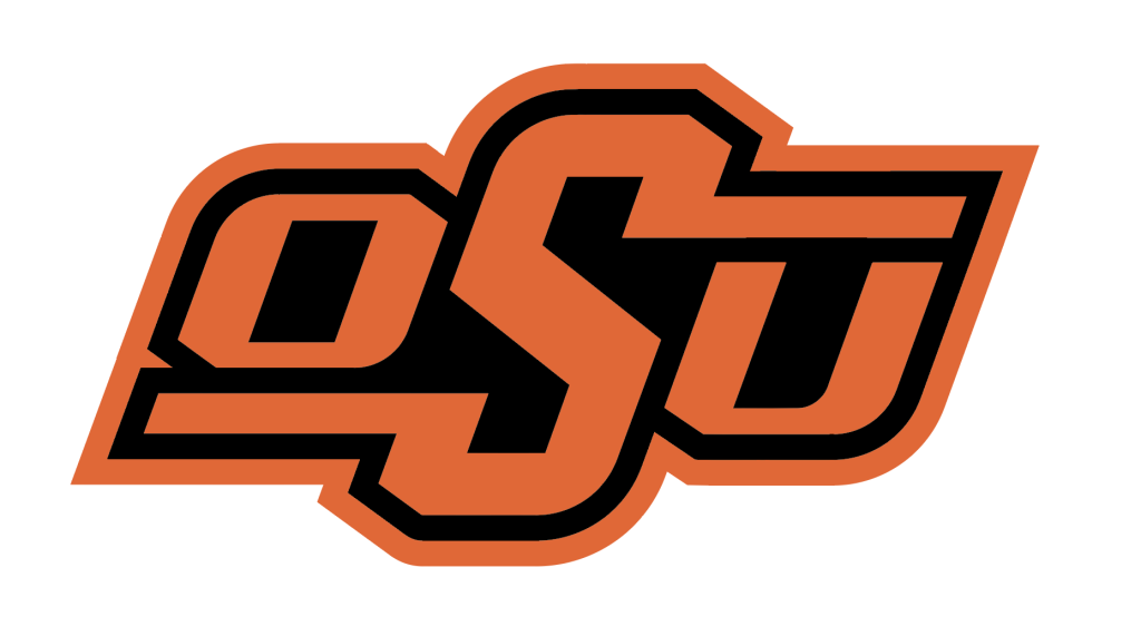
This is how it SHOULD have been done:

Instead of notching the space between the “O” and the “S”, they could have not notched the space between the “S” and the “U”:

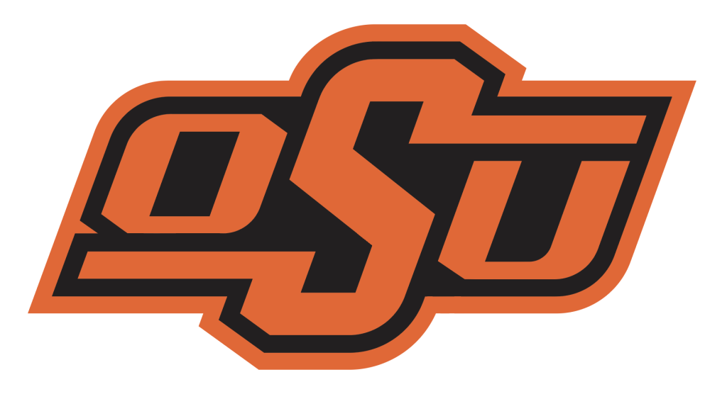
However, if you do that you are setting the expectation that in the black offset outline there is no indention, so you really have to remove the notch between the bottom left corner of the “O” and the tail of the “S”. Like this:

I like the notches best, but they should be consistent. GO POKES!

Houston Has A Problem

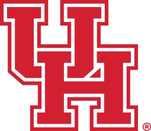
The University of Houston that is. Their interlocking UH logo is wrong. It’s actually very simple.

This is the official logo:

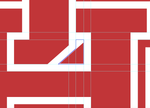
This is how it SHOULD look:

If you simply look at where the white band falls for each letter and fill in the gap you get a different element than they placed in the logo:

Unfortunately, someone was asleep at the switch or just lazy. They should fix it…..

And they have another problem….Oklahoma State 43 – U of Houston 30 on November 18, 2023.

If You Build It….

A dear friend has decided to start his own home building company. He has a very engaging vision to build affordable housing, not cheap housing, efficiently built housing that is therefore more affordable. I love the idea and since he is like my brother I decided to help him create a brand.

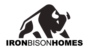
The name of his company is Iron Bison Homes. This is great because I LOVE bison too! He had some ideas but I was concerned that they were too routine. I started playing with a side view that was very high contrast and graphic art styled and added the text in an alternating bold-thin-bold to allow me to eliminate the space between words.

I liked the font forms (and so did my friend) but I immediately saw what he needed. It took several iterations, which I won’t show here, to get the final form.

I used his hump (now pointed) and the slope of his back and tail to create a “roof line”. Moving his legs around and decreasing the gaps between solids gave him a more substantial feel. Finally, adding a door in the largest foreleg completed the “Bison House”.

The door both make the Bison a house and signifies the opportunity that affordable housing can provide.

Once the monochrome versions were complete I thought about colors. My friend had no preferences. I quote, “As for colors, I like black, silver, grey, white.” So I thought about building and wood seemed the most likely thing. Finding the right wood and using some photoshop magic resulted in the final full color version:
This will look great on an office wall:
Finally, I mocked up a business card idea:

Rose Rock

I was having breakfast with a dear friend who is starting a business. He mentioned he was thinking of naming the new venture “Rose Rock”. He liked the Oklahoma connection and the somewhat timeless feel. The rose rock is an aggregate of barite and sand formed like a fully bloomed rose, with five to twenty radiating plates or blades that appear as the petals. Few mineral specimens are as distinctly recognizable and traceable to source as the barite roses from Oklahoma. These are also known as “rose rocks” and “barite-sand rosettes.” Other than minor occurrences in Kansas, Morocco, and Australia, the barite roses are unique to this state.

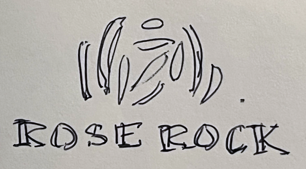
While we talked I sketched this in my book:

My friend liked the concept so I started working it. I tried several ways to render a rose rock form in a very minimal graphic style, but nothing worked as well as my original sketch, so I copied it in Illustrator and finally came to this:

Frosty Design

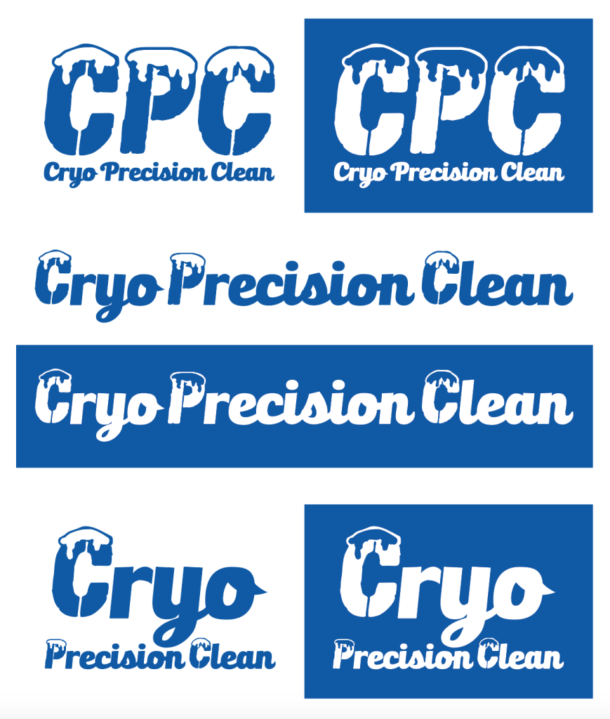
A friend I have done design work for before called me recently about a new business venture. He said he was starting a company to do dry ice blast cleaning. The name of the company is Cryo Precision Clean.

He said he want to use blue colors and ice or snow. Other than that, he didn’t have a lot of ideas. I told him I would think about it and see what came to mind.

The idea of a service company made me think about the retro logos from service companies from the 50’s and 60’s. They were clean, simple and single colors, a little campy, and gave off that “logo on the door of a truck” vibe. They were almost always embroidered on the service people’s uniforms.

I found some fonts I liked, an “Icy” text: CF Grand Nord Regular, and a “Script” text: Bulletto Killa. I started with playing with the initials and the spelled out name:

I liked the direction but felt the Icy text was too complicated and there were things about the script I didn’t like, especially the lower case “y” and the way the “n” ended. So I took out the “extra” stuff in the initials, edited the snow on one “C” (I actually used the “O” and created a “C” from it. Then I borrowed a “y” letterform from another font to get a better descender and cleaned up the connectors on all the letters and the ends of the “n”.

I also changed the “C” for the usage where the name is spelled out under the initials because repeating the “icy” letters wasn’t an option. The result was a letter logo that can be used with or without sub-text, a textual logo, and a vertically oriented textual logo amplifying the “Cryo”.

The logos work in positive or negative single color. The blue is CMYK 100,70,0,0.

Making The Cut

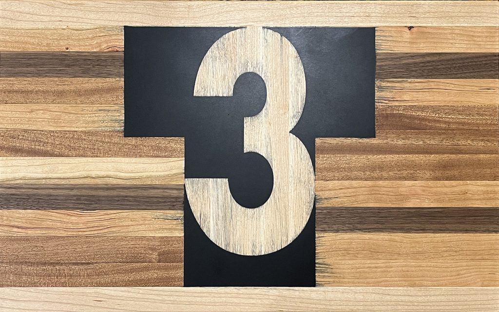
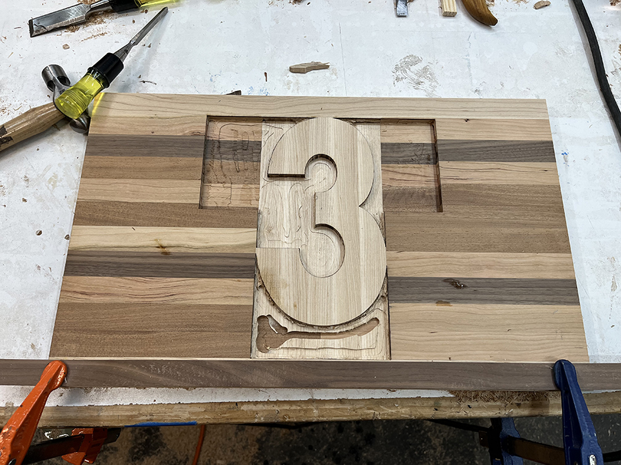
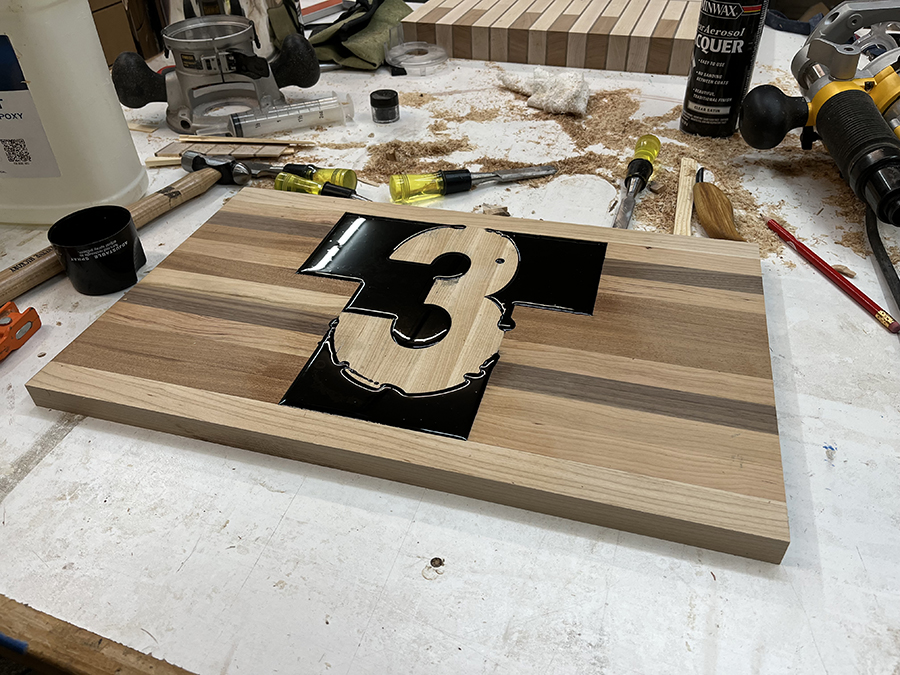
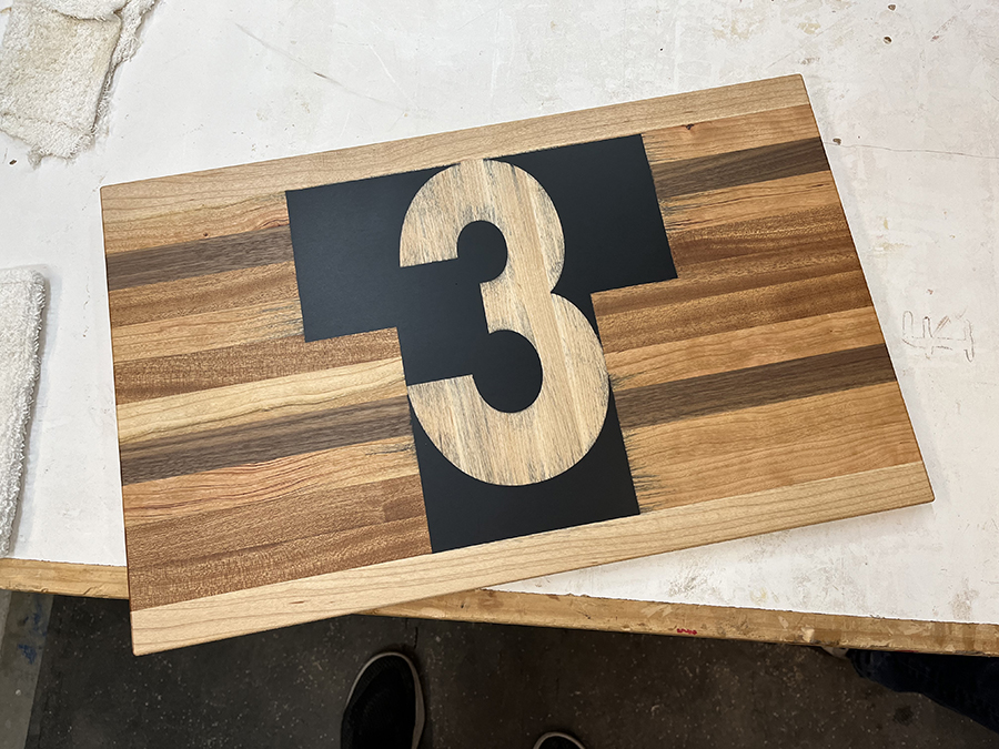
We recently had the opportunity to work with a craftsman to make cutting boards. I decided to make a charcuterie board with my T3 logo (of course.)

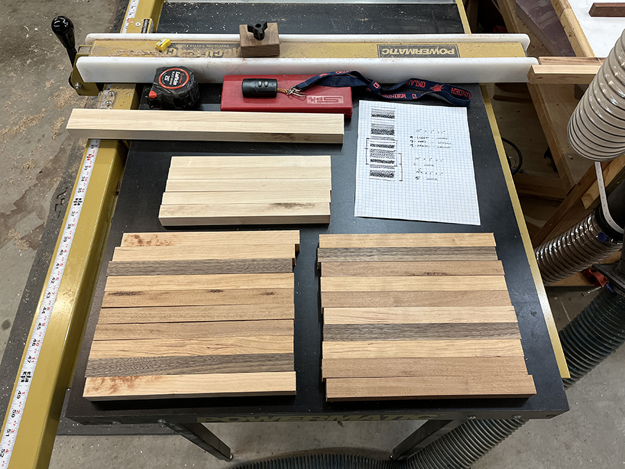
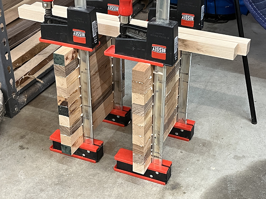
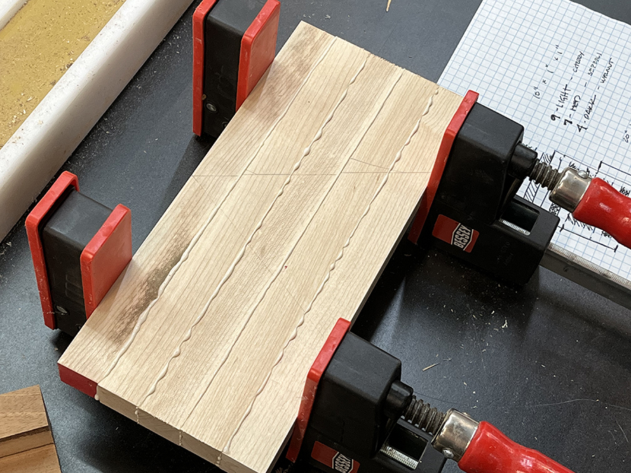
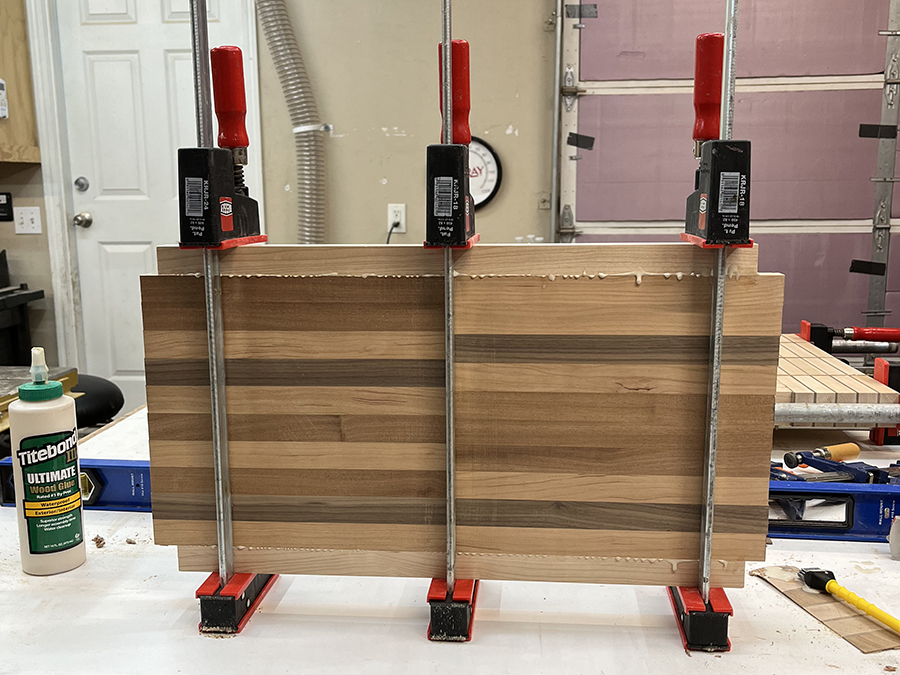
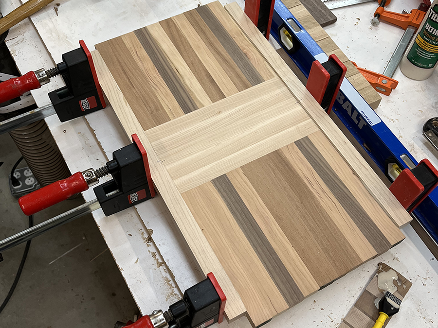
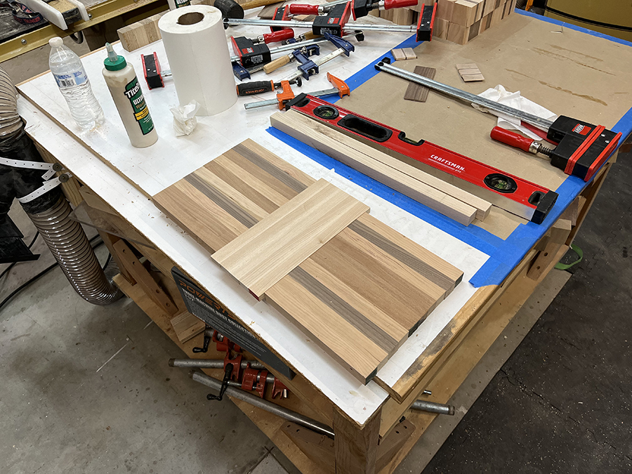
We had to select wood and create several glue ups. It took some creativity to figure out how to get the different woods where I wanted them, but we got it done:

Wood selection and pattern

Glue up 1
Glue up 2
Glue up 3 (back)
Glue up 3 (front)
Ready to trim
Routing out the design
Filled with epoxy
Finished!
Posted in:

Visionary Branding

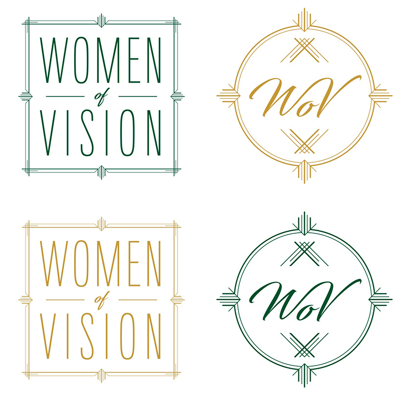
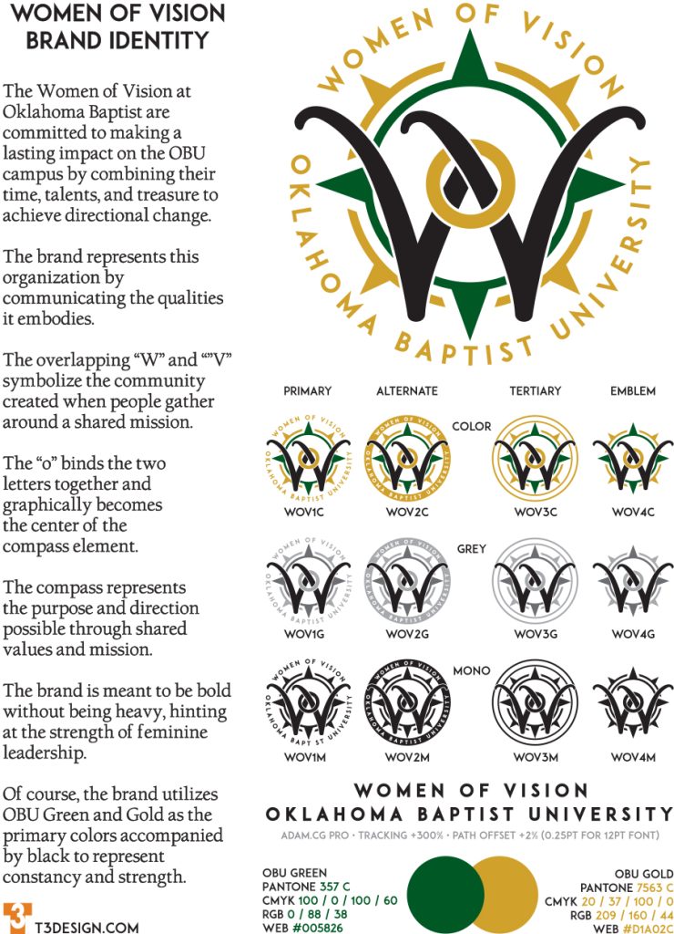
I was recently given the opportunity to help rebrand the Women of Vision at Oklahoma Baptist University. This was the current branding:

The women were looking for something bolder and more representative of the values, mission, and vision of the group. I immediately thought of overlapping the “W” and the “V”. I also needed an element to ground the text based components and symbolize directional change. I created a compass element and began to play with ways to incorporate the WV element and this was the result. I also created an alternate mark with a solid ring for the text, a tertiary mark with no text, and an emblem which is the WV and compass alone.

The Mark of a Life Lived Well

I have a dear friend in Zeeland MI. Zeeland is a small community just outside of Grand Rapids and is home to Herman Miller furniture. On a trip to visit Herman Miller in November of 2018 I first met Sally. She was our host for the beginning of our experience at HM and she shared compelling, first-hand accounts of the early days and designers that made the furniture line famous. Her warmth and friendliness were magnetic and when she told us we should visit her home if we came back we took her invitation to heart.

A few months later we returned to Grand Rapids to revisit a different company but we also set aside time to visit Sally. She was surprised but delighted that we took her at her word about the visit. She told us she made that offer many times, but we were the first to take it. Her home was meticulous yet inviting. Filled with art and furniture (which is also art), she and Bill raised their children there among the HM artifacts, many of which even the Herman Miller museum doesn’t have. She served us snacks and we talked about life, family, art, her career, and too many other things to list. We eventually went to dinner with her family and then came back to the house to say goodbye. She asked if we wanted to come in for a few more minutes and we jumped at the opportunity, by then we were already becoming fast friends.

We have visited since and kept in touch by email and text. We mourned when their daughter lost her long battle with cancer and then again when Bill was suddenly taken too. She also followed our little group through victories and valleys including the tragic loss of our friend’s twin brother. Sally calls us her “Oklahoma family” and we are grateful to have her as an adopted mother. Sally is an example of a life lived well. She has embraced every day, every challenge, every opportunity with a joy and enthusiasm that makes her seem decades younger than the calendar claims.

On my last visit we somehow got to talking about my personal brand and that I had created several for other people and of course I offered to create one for her. It was hard to tell whether she would have a use for something of this nature as she rarely promotes hersef in any way, but I decided she would have one to use or not.

Given her long and storied career with Herman Miller, and her love of the design work of Alexander Girard and Ray & Charles Eames, I started working on a logo and eventually came up with this:

SG 2x2

This is the Brand Guide Statement:

Sally’s life is marked by unflinching consistency in everything she puts her heart and hand to. As a young woman working at Herman Miller, as a wife and mother, and as a dedicated servant in her community. Sally Gruppen loves well and lives well. The Irving Harper designed French-curved M in bold red serves as the container for negative space initials in a font form created to match the curve of the Herman Miller shape. Intentionally manipulated spacing results in a symmetrical square space, with a little bit of a Girard feel to it. This logo acknowledges the years Sally spent serving at Herman Miller, the commitment to family and community, and her love for design and beauty.

Fishstick

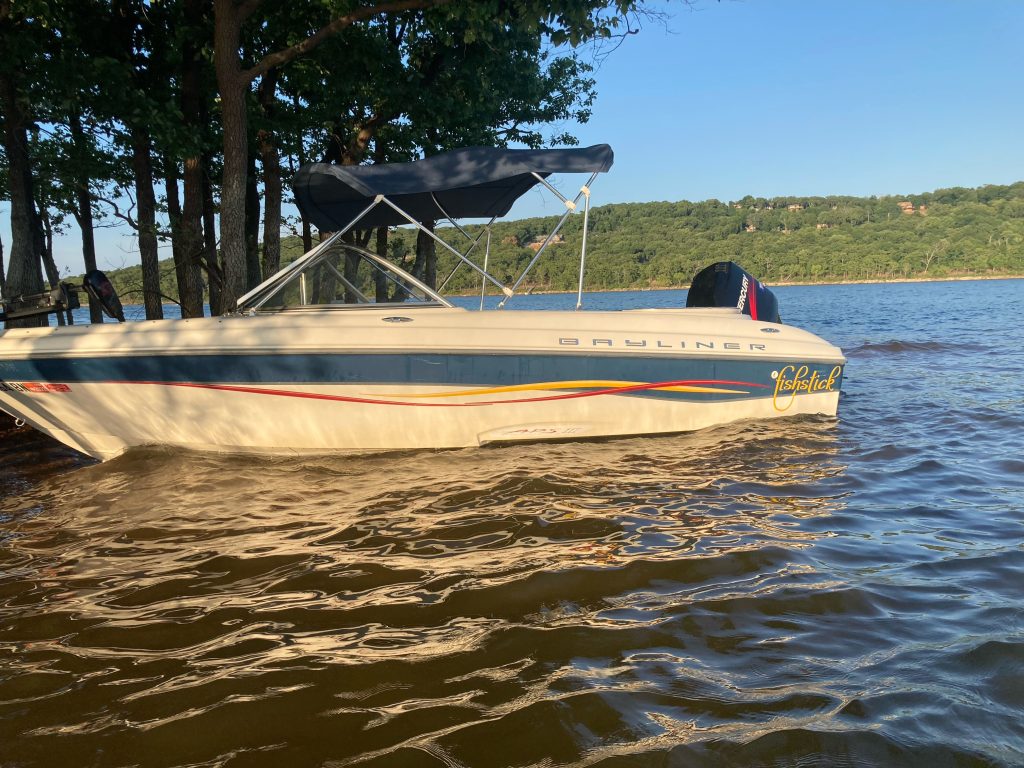
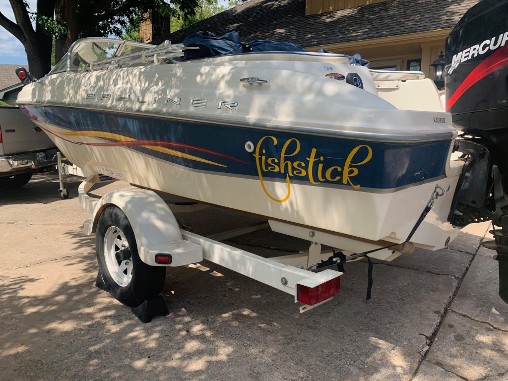
My son likes the boating life. He bought a flat-bottom aluminum fishing boat. I thought he was crazy. Then a while later he sold it and bought an outboard boat that he could pull skiers AND fish from for only $500 more. He loves it.

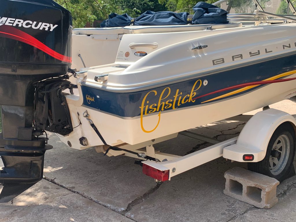
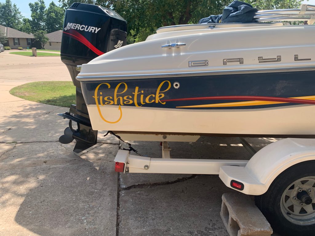
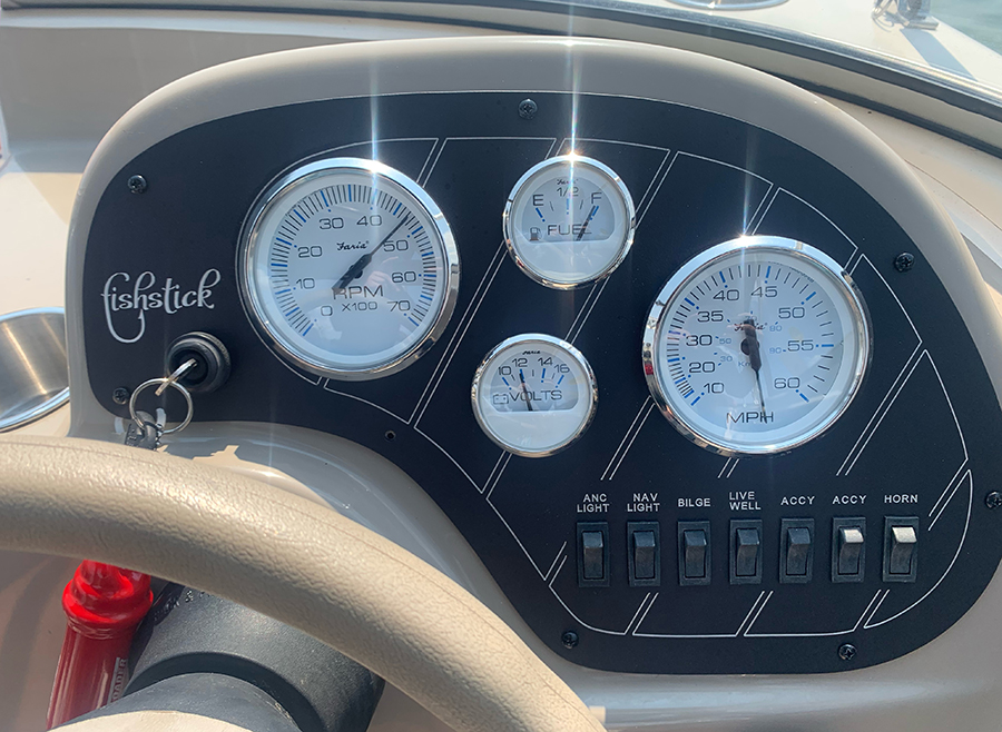
When he bought the “new” boat it needed a little TLC. He cleaned, polished, repaired and loved on that thing. I helped with a few things, the main one being a new dash panel. At some point he named the boat “Fishstick” and I asked if he would like a logo. He thought that would be great, so off we went…

Fishstick Logo
Fishstick in the water

After we designed the new dash panel, we had the logo engraved along with the designs and the labels.

FIshstick Dash

Patched Up

t3 patch

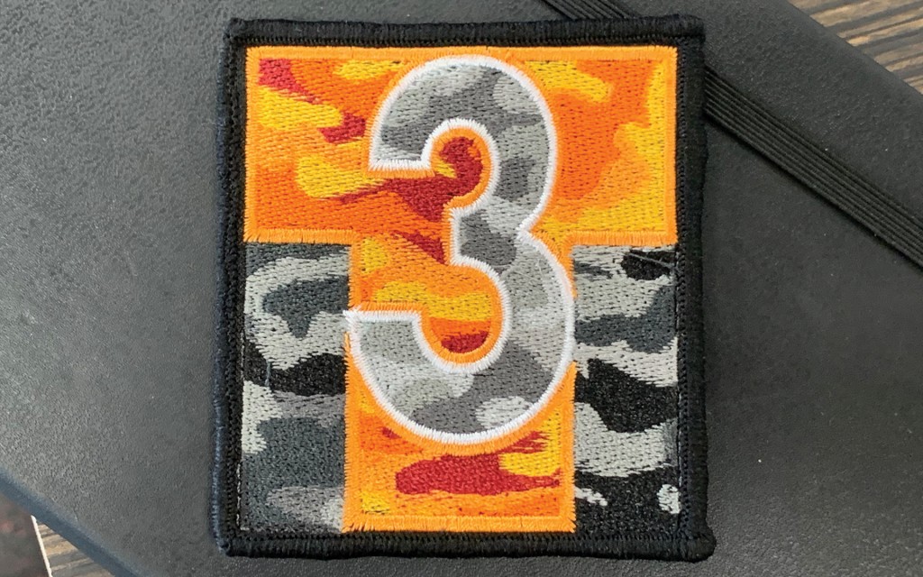
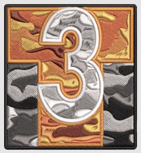
My son got into airsoft as a sport. They are a pretty dedicated group, decked out in full combat gear and carrying very realistic looking airsoft guns. He asked me if I had a patch he could add to his gear and I had to say I did not. That needed to be fixed.

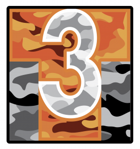
I couldn’t decide what to use for the fills on the patch to give it more interest than just orange and white. My son suggested orange camo. I found a camo pattern I liked and imposed it over the whole patch. I then converted the “3” to white and lighter shades of gray, and the background to black and darker shades of gray. White and orange outlines and a black merrowed edge and all that was left was to send to the patch maker.

Screen Shot 2021-09-07 at 2.21.09 PM

I choose to use Custom Patch Factory as I had used them before for another project and was pleased with their work. I uploaded my art and soon received a proof:

Screen Shot 2021-08-24 at 1.35.03 PM

I as very excited about how the patch was going to turn out. I didn’t have to wait too long till they arrived. All in all a great T


Posted in: