I love doing logo design. When someone has an idea I relish the challenge of creating a visual identity that people will link to the product or service. When the “client” says, “Wow” it is all worth it.
So, my best friend texted me recently, “Any chance you want to do a logo for me?” I replied, “Maybe. What for?” (I’m picky about what I work on. I say “client” because I never work for pay. I do this for fun. I do this to relax. I don’t work on things that don’t grab my interest and I don’t work for difficult or cranky people…) So he texted me back the general idea: basketball trainer, needs to grow client base, has opportunity to brand his program, maybe even create app and web site… So I said, “Ok. I’m in.”
One of the difficulties in design is the preexisting conditions (sometimes called “ideas”) that color the initial design work. You cannot ignore the client’s concepts and desires, but you have to guide the work product to better design and better concepts if you can.
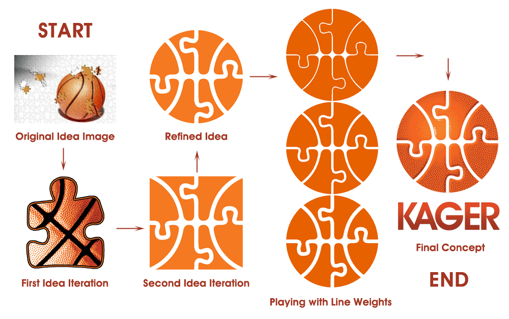
Kam, the client, had a picture of a puzzle that was almost finished with an image of a basketball. He liked the puzzle piece concept as a metaphor of him putting the pieces together to develop a complete player. The first iteration of the design was a puzzle piece with a basketball treatment. The piece was shaped to be slightly humanoid. It was a decent design, but the client and my friend weren’t really feeling it.
As I looked at the lines on the basketball I could see the eight “pieces” that made up the iconic shape. I then thought, “what if there were puzzle tabs and and blanks (the sticky-out parts are tabs and the holes they go in are blanks) on the pieces of the basketball shapes?”
A square idea, then refined to a round one, some effort to get the line weight right and the basic icon was done. Creating the stippling from a basketball and the debossing that occurs along the lines of a real basketball with the result posterized into just 3 colors and white gave us a full color version that “feels” like a basketball that leans heavily to “icon”.
Logo design needs to accommodate monochrome, colored and often full color versions. I like to consider how the logo could be used in print, web, embroidery, and other methods of reproduction. The final mark set includes a B&W, spot color and full color version.
Finally, we needed a name. The idea is to create a recognized and memorable brand, tied to basketball and Kam. An old school term for a basketball player is “Cager” from the days when basketball courts were surrounded by cages to protect the fans since the teams fought over out-of-bounds balls and there were no backboards. Kam is pronounced like “cam”, so taking the “K” for the “C” resulted in “KAGER”. Using a sans serif font, I adjusted the kerning and combined the K and A into a single article.
Overall, I am very excited about the design, as are the client and my friend. This was a really fun project.

