I can’t help it. I notice how things are designed and executed. Most of the time I notice how things could be designed and executed better. Execution is the bridge between concept and final product. The best idea, poorly executed, results in a poor product. A mediocre idea, well executed, can produce a very good product. The magic happens when you have a great concept and you execute it really well.
On the left is a poster for our school’s production of a Shakespeare play. The concept is good, but there are several problems with the execution. On the right is my execution of the same concept for the same play, using the same base image and the same information.
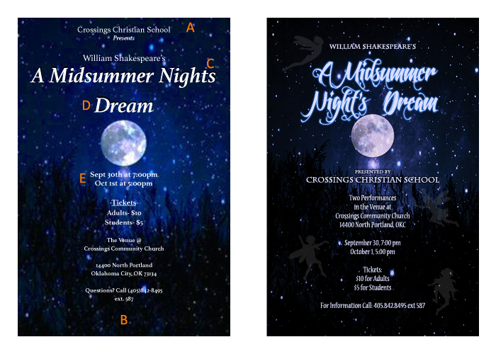
Some of the primary problems with the original execution:
A. The text at the top is crowding the edge. We always need some room around elements but especially at the edge.
B. Whoa! No margin at the top then a 2″ margin at the bottom. One might think the text got shifted up accidentally, but the text flows around the moon, so it is probably where it was intended to be. Violating margin space can be a useful creative effect, but it has to be intentional and it has to accomplish something visually or impact the message. In this case it just looks like a mistake.
C. The correct spelling is “A Midsummer Night’s Dream”. The apostrophe ‘s’ is important, which brings up an important point. Spelling, grammar, punctuation, people and thing’s titles—these things matter immensely! Nothing erodes your message as much or as fast as being sloppy with your proof reading. Plus, this is really simple. Spell checkers will catch many things, but make a habit of looking up all names, titles, places, etc. Then, GET SOMEONE ELSE TO LOOK AT IT!
Why? Because it is impossible to proof read your own material. As with all high level tasks, your brain generalizes simple, component parts (like turning letters into words and words into sentences) so it can focus on more complex tasks (like combining sentences into complex ideas). When we’re reading other peoples’ work, this helps us arrive at meaning faster by using less brain power. When we’re proof reading our own work, we know the meaning we want to convey. Because we expect that meaning to be there, it’s easier for us to miss when parts (or all) of it are absent. The reason we don’t see our own typos is because what we see on the screen or page is competing with the version that exists in our heads.
D. Three words on one line (crowding the edges again) and “Dream” is left as a widow. Widows are problematic in both layout design and in publishing. Our brains do not like to see a single word that is part of a larger group of words hanging out all by itself. We often go to great lengths (with spacing and compression) to make sure that we don’t create widows in published text.
E. September is abbreviated to 4 letters and October is abbreviated to 3. Consistency is also important in design.
Unimaginative font selection kind of rounds out the issues. In most layout work one is limited in font choices by readability and often style guides, but in poster design you are allowed to get a little wild, and you should
Finally, the image was either resized from a low res jpeg or imported incorrectly into the layout program resulting in the poster being pixellated and blurry:
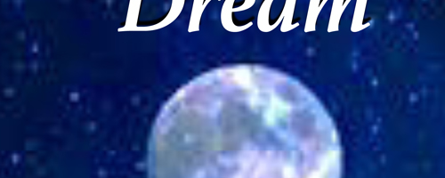
I was able to find the same image in a higher resolution, but not high enough for the size of the poster (11×17). So I enlarged the image, then applied a water color filter to create an artistic look instead of just a pixellated or blurry one.
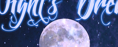
This is a common problem when people pull images off the web without an understanding of how raster graphics work and how the programs they are using will treat the image. This is also a great example of why you should always proof print your work and verify that image quality and flow have not been impacted in the transfer from the program you created the piece in to the printer.
It did require some rearrangement and rewriting to solve the textual problems. I chose Feathergraphy Decoration to set the title, Charlemagne Standard for the Bard and the School, and Nueva Standard for the rest of the text. All the text is set in a color picked from the lighter stars, sort of a light blue leaning to the red side. The title set has a rasterized font layer expanded, filled with a darker blue from the same color field, with a Gaussian blur applied to create a glow (I don’t always like the glow from the effects set in Photoshop.) The rest of the text has a black glow around it to help the readability when there is a bright spot near or behind it.
In short, the concept was sound. It was a good idea. Errors in execution kept the idea from coming through and greatly limited the effectiveness of the piece.
As a little extra, I used the ability of our digital press to print four fairies on the poster in clear ink. They are visible because the sheen of the clear ink is different and it slightly alters the underlying colors. They are there, but they aren’t. Kind of like the fairies in the play….
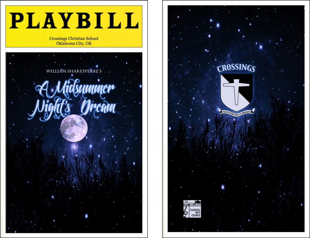
They also needed to use the poster design for the playbill cover, so a little adjustment so the size was correct for the front and some additional art for the back cover:
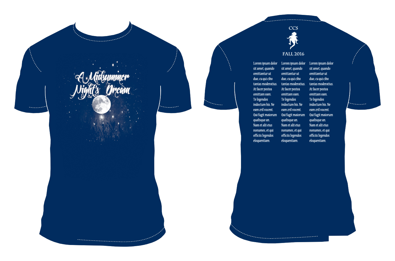
I am sure there will be a shirt design too. This is an idea I would have suggested for that:
