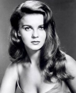
 In 1963, a year before I was born, a movie came out based on a Tony Award winning play: Bye Bye Birdie. It starred Ann-Margret (making her a superstar) and many other well known actors and was an immediate hit. The movie caused some controversy because it strayed considerably from the stage version and many people thought it was turned into a vehicle for Ann-Margret. Paul Lynde, who played Mr. MacAfee both on stage and in the film, later quipped “They should have retitled it ‘Hello, Ann-Margret!'”
All that aside, both the play and the movie are fabulous. Yes, I had a crush on Ann-Margret. Yes, I know she is old enough to be my mother. No, I do not agree that this is creepy. Still, she was and is a fabulous actress and singer.
So….our kid’s high school is doing Bye Bye Birdie as their spring musical! What better venue to reproduce a “happy teenage musical with a difference”? The story centers around a group of teens and how it effects them when their favorite musician is drafted. This concept mirrored a reality of the time (1957) when Elvis Presley was drafted into the Army. In the play, Conrad Birdie (a play on Conway Twitty) is drafted and before he leaves comes to Sweet Apple, Ohio to give fifteen-year-old Kim MacAfee (played by Ann-Margret) a last kiss before departing. Yep, this is really good stuff…
I offered to help the drama group with design and have already worked up posters for the production. Early in the movie there is a scene where the teens call each other on the phone and spread the news that Kim and Hugo have gotten pinned. The lyrics include the lines:
What’s the story, morning glory?
What’s the tale, nightingale?
What’s the word, humming bird?
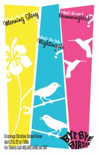
So instead of the traditional images of an elvis like character, guitars, and such, I thought we should play up the telephone game angle:
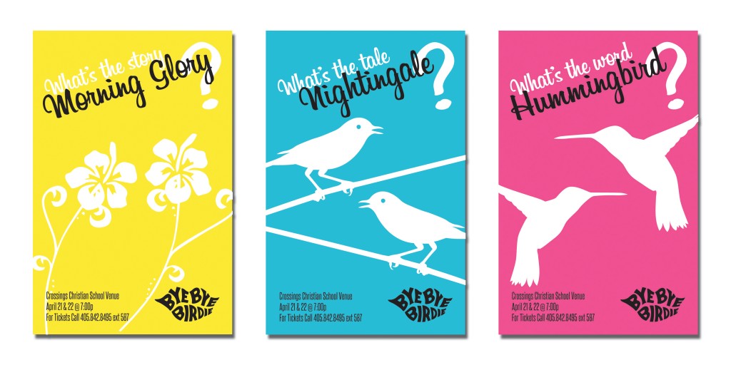
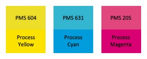 I thought it might be cool to have multiple posters because the play is not really single dimensional at all. I selected three colors that are close to the process ink colors (CMY) only a little muted and “dusty”. Because these colors are the triad for the subtractive color system, they appear to “match” visually for most people. With the colors set, I played with silhouette images for the morning glory, the nightingale and the hummingbird. Once I found an image for each that I thought had similar levels of detail and form, I decided to put two of them in each poster, mirrored, to evoke the play of relationship in the stage production. The play seems to be about Conrad Birdie going away, but it is really about the relationships—Kim’s parents, Kim and Hugo, Albert and Rosie, Albert and his mom—and how each person is getting, or not getting their needs met. I needed a soft script that was playful but not too silly for the verbal clues, so I chose Billabong, putting the repeated question in white to be at depth with the silhouettes and then put the primary word in black and larger to bring it up to the front.
Finally, I included the standard logo for Bye Bye Birdie in solid black, smaller and in the right bottom to tie the design to people’s knowledge of the play and completed the poster with the production information in Steelfish font.
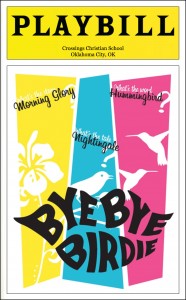
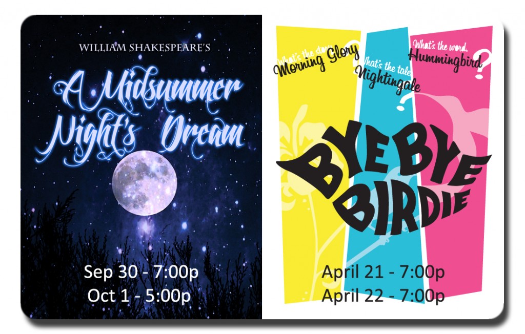
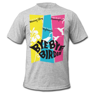
The Playbill cover and other collateral needs a single image, so I also created a combined image:
