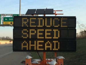
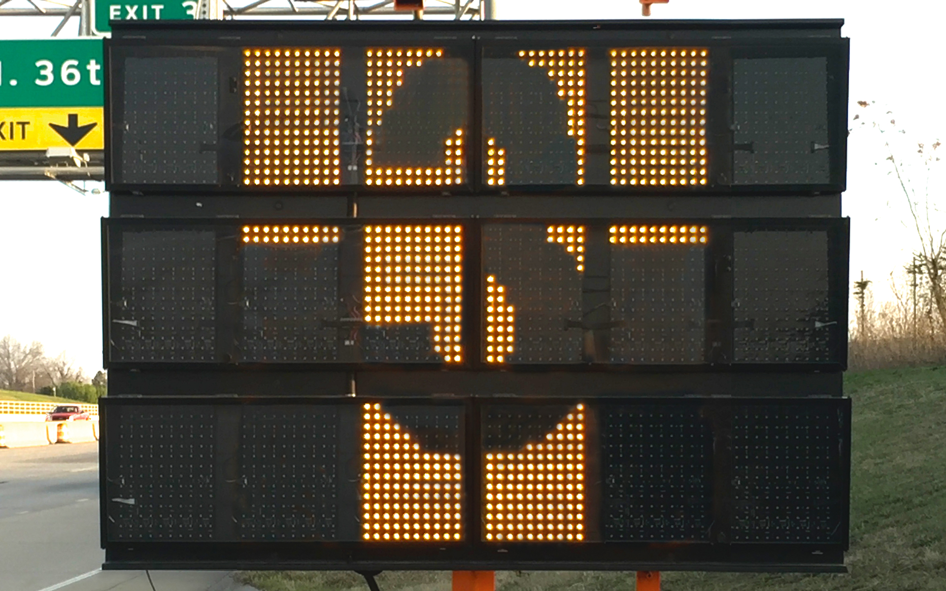
We have a lot of construction going on around my home and business. Thankfully, the construction crews are nice enough to put up digital signs warning us of the changes in lane closures and delays. I drive by these signs everyday and so it was inevitable that I would think about one of them displaying my T3 logo.
I happening to be going the right direction at the right time of day to get a pic of a sign in the shade but with the background sunlit. This produced the best combination of the sign being visible without being too bright and the surrounding material being well lit also.
I pulled over, put on my hazard flashers and started taking pics:

Back in photoshop I straightened the image, reduced the width of the sign while leaving the surrounding material intact, then began editing the sign pixels to light the ones I needed and “turn off” the ones I didn’t.

