My daughter is directing (with some friends) our middle school production of The Lion King Jr. This would be enough to get me involved in the graphic design end of this project, except that I was already doing all the design for the theater arts at our school anyway.
I wanted a consistent look for all the productions so I decided to tie all the plays together with high contrast, 3-4 saturated colors, and bold, monochromatic images.
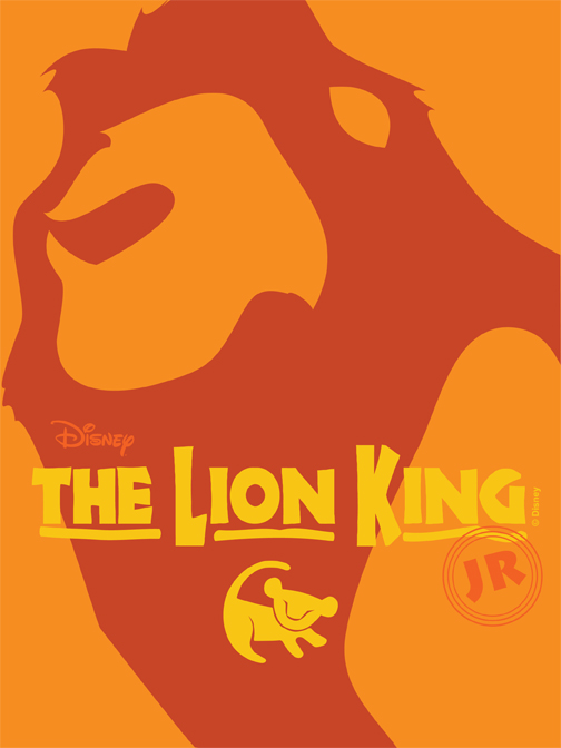
After gathering vector images of the title blocks and the Disney logo and familiarizing myself with the requirements for acknowledgements and such, I digitized Mufasa by reducing him to two colors and then vectoring the result.
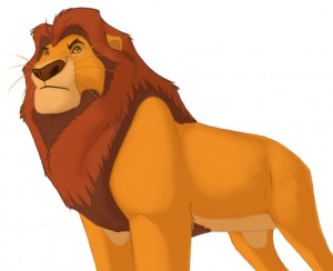
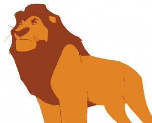
Then I reduced the complexity of the lines in the mane and removed some details to get the final piece to use in the collateral:

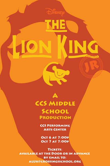
Once I added the necessary text to comply with Disney requirements and the needs of the production I had a fairly full poster, but I still think it is simple and bold.
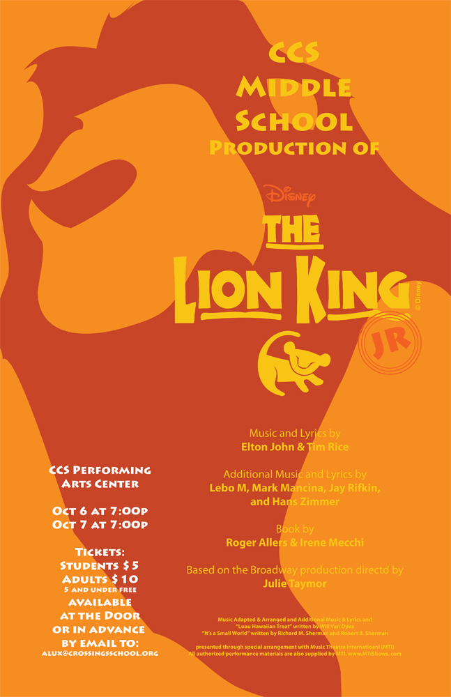
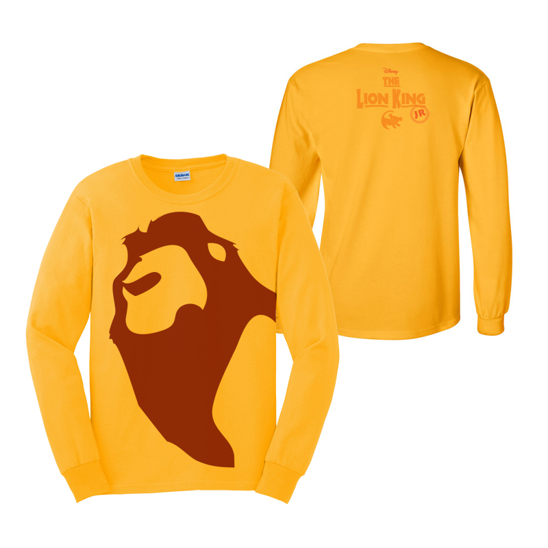
Additional collateral created included:
