A friend of mine has her own consulting firm for construction project management and owner representation. She did what many entrepreneurs do and put together a logo to use on letterhead and invoices.

This isn’t a bad logo. However, in spite of her design background (she has a degree in architectural interior design), looking at some of the elements we can find areas for improvement.
1. The “M” within a bounding box of color is crowded and the letterform forces a rectangle rather than a square. When designing a logo, whenever possible it is best to create an option for a mark that is square or round. This works best for social media and many online identities.
2. The black text is all the same size which gives all three words the same weight. “CONSULTING” is longer, so if anything is pushed to the front it is this. “MASON” should be the prominent word.
3. Additionally, the black text being aligned with the horizontal boundaries of the red box looses some of the interest that a change would bring.
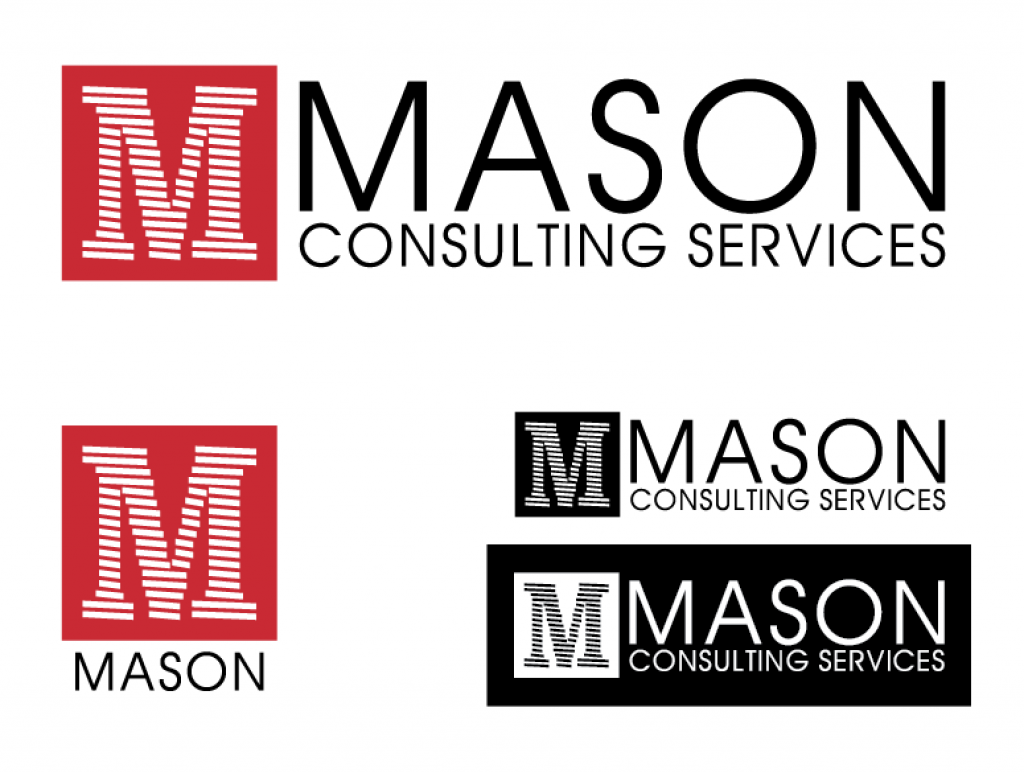
Making these changes we came up with an updated logo:

With the different letterform for “M” we get a square bounding box and a “constructed” letter. Bringing the size down a little gives us some margin around the “M” so it doesn’t look crowded. The red has been updated to reduce the maroon hue. The new red is PMS 1797C (15,98,93,4).
Switching the font for the rest of the text to Avant Garde gives us a letterform for “M” that matches the mark but sans serif. This font also has a round “O” and consistent stroke width. Insetting the text from the top and bottom horizontal boundaries of the red box gives the mark a little boost. Finally, making the “MASON” large and subverting the rest of the text helps create layers of interest.
The new look is fresh and intentional but people familiar with her current logo will recognize the new one.


