A dear friend has decided to start his own home building company. He has a very engaging vision to build affordable housing, not cheap housing, efficiently built housing that is therefore more affordable. I love the idea and since he is like my brother I decided to help him create a brand.
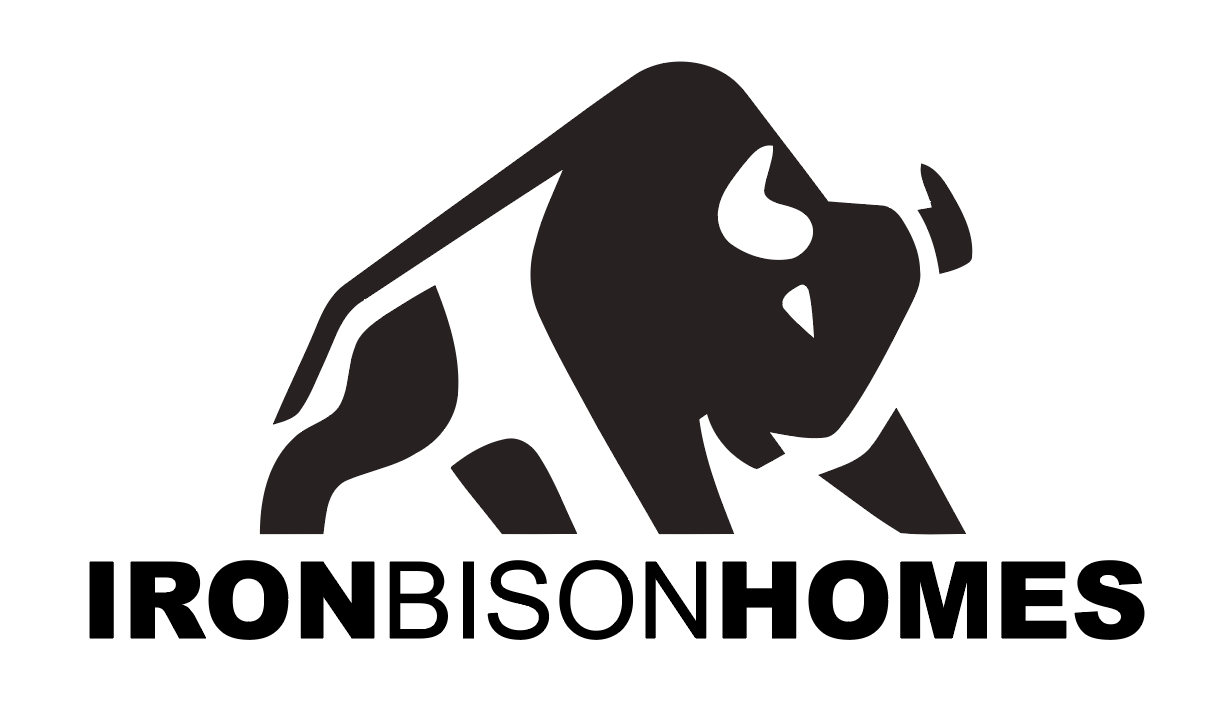
The name of his company is Iron Bison Homes. This is great because I LOVE bison too! He had some ideas but I was concerned that they were too routine. I started playing with a side view that was very high contrast and graphic art styled and added the text in an alternating bold-thin-bold to allow me to eliminate the space between words.
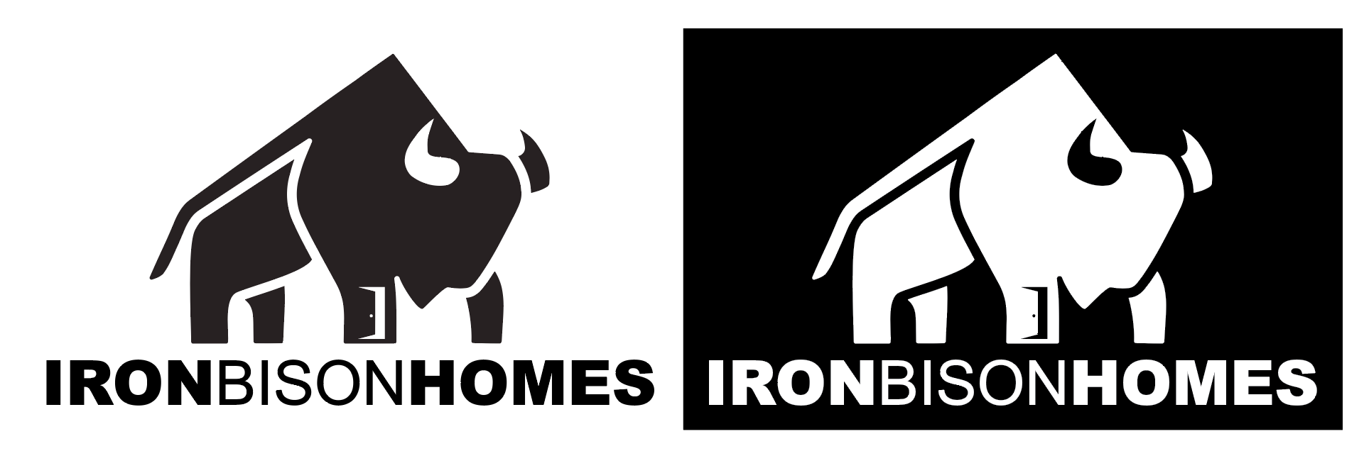
I liked the font forms (and so did my friend) but I immediately saw what he needed. It took several iterations, which I won’t show here, to get the final form.
The door both make the Bison a house and signifies the opportunity that affordable housing can provide.
Once the monochrome versions were complete I thought about colors. My friend had no preferences. I quote, “As for colors, I like black, silver, grey, white.” So I thought about building and wood seemed the most likely thing. Finding the right wood and using some photoshop magic resulted in the final full color version:
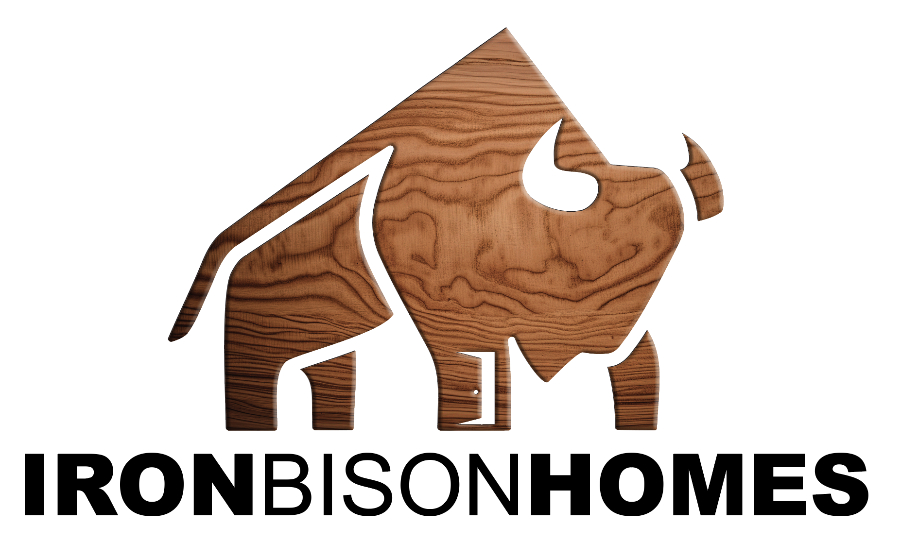
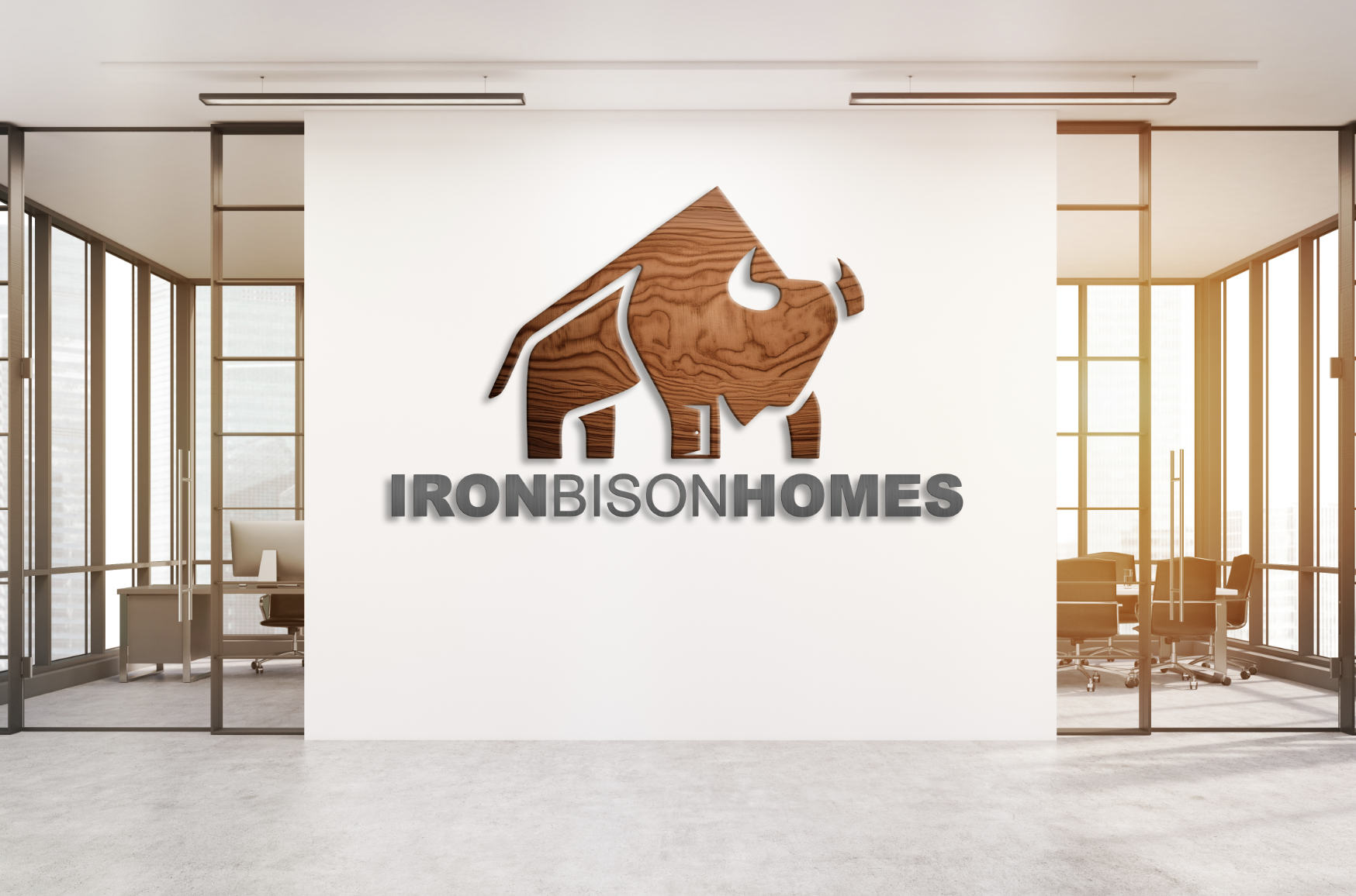
This will look great on an office wall:
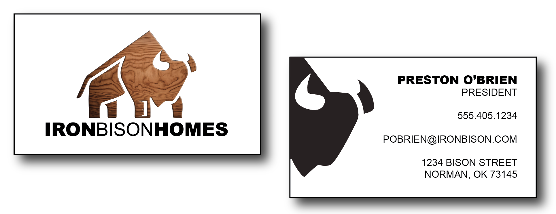
Finally, I mocked up a business card idea: