I’m heavily involved in an organization that radically changes the lives of drug addicts, alcoholics, and those that love them. Started over 10 years ago with a single sober living home, HIA has grown into a comprehensive life recovery program being lived out in two dozen homes in 12 different cities, as well as Finding Hope groups across the US.
The next step to creating the highway to health is a treatment center. Called The Healing Center, this new phase of HIA will provide an in-patient recovery program as the first step before joining the community in a sober living home. Future growth will include IOP care, and follow-on therapy.
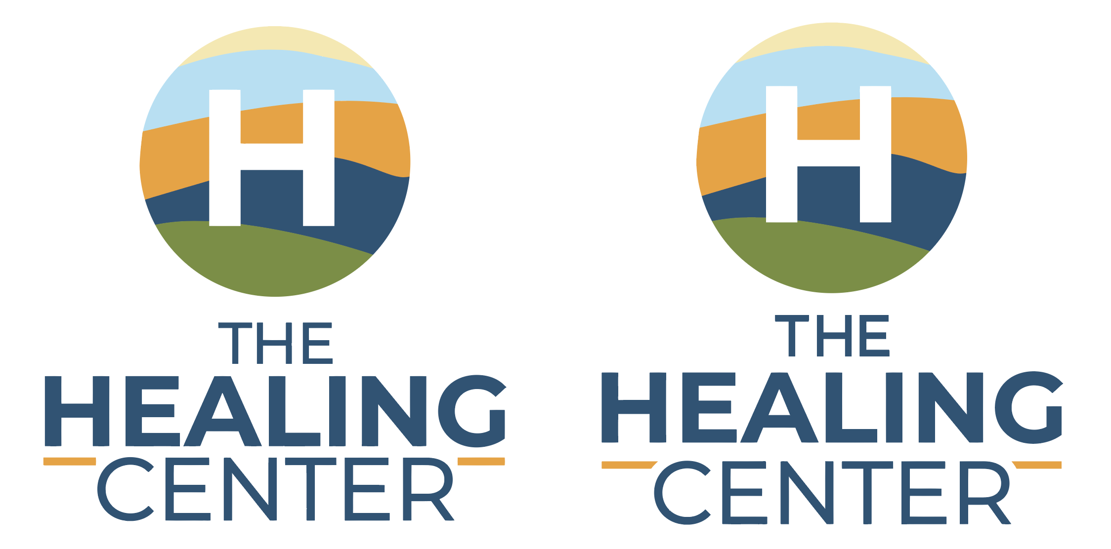
So, when the founder and CEO sent me the concept for The Healing Center logo I could help myself and offered some suggestions.
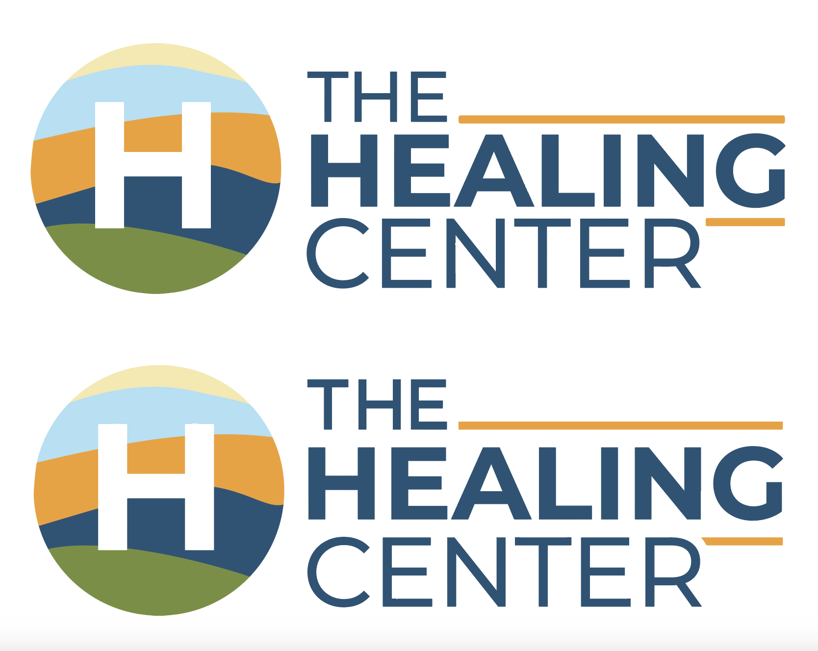
The original is on the top. My adjusted logo is on the bottom. First I increased the weight of the font forms in “THE” without changing the scale of the letters to match the weight of “CENTER”. I adjusted the spacing between the words, then I matched the width of the gold horizontal elements to the weight of the secondary lettering and created a formed end where they interact with a letter. Minor changes really, but they improve the look significantly.
I did the same things to a vertical version. The original is on the left, mine on the right: