One of my sons who works for my favorite university (I’ll let you figure one which one) needed to update the header (read logo) of a weekly communication he sends out. He had a great initial idea and sent me a screen shot of one of his early drafts to see if I had any thoughts. Surprise, surprise, I did.

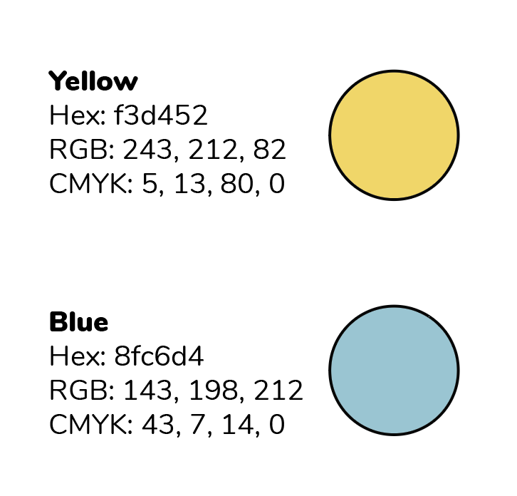
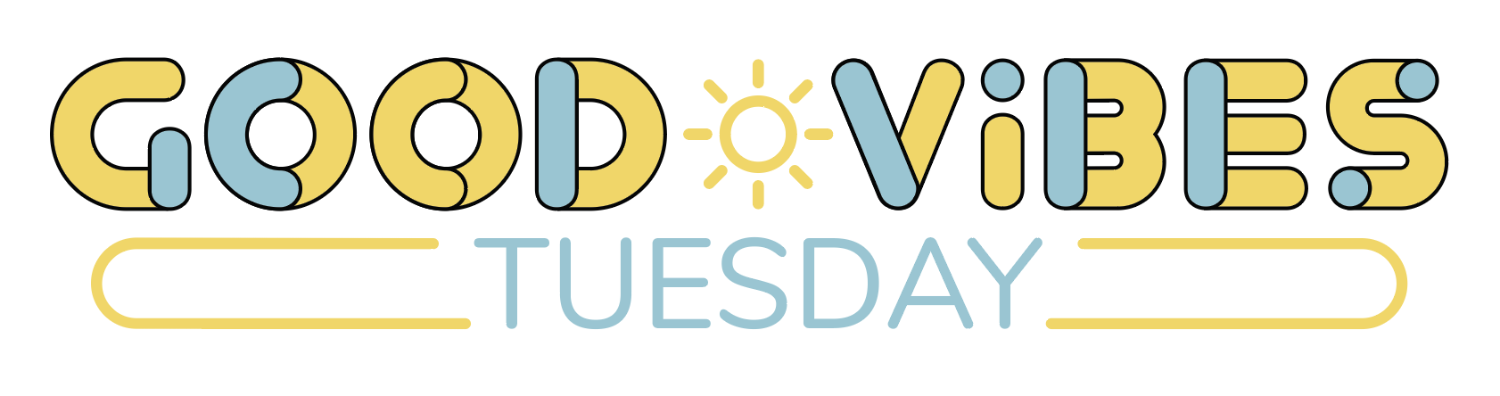
My first thought was that the blue sections of the headline font seem arbitrary and a little unbalanced. I suggested that he use a blue circle the diameter of the width of the vertical elements in the font as the center for the two “Os” and a blue bar as the center for the “D” and blue circles for the centers of the two elements of the “B” and then put blue circles inside the font for the “S” on both ends of the “S” form and flip the eye so that the dot is a blue and the vertical is yellow.

This looked better, but still wasn’t really balanced and seemed to be missing something. We both got busy and didn’t mess with it for a while. Then one evening I got it back out and started redrawing, leading to this:
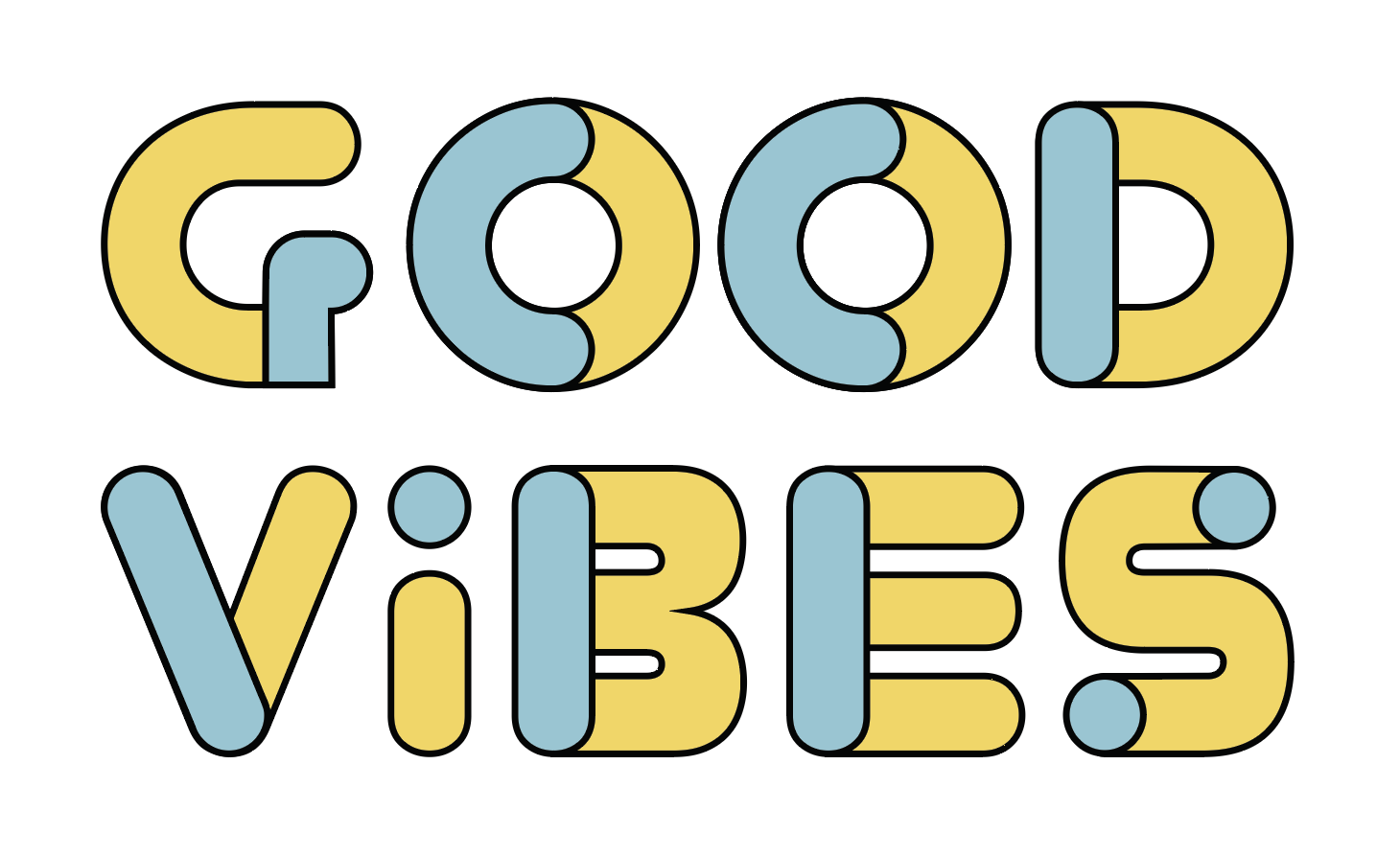
The logo is based on the “YoureGone” font. I sent it too him and he liked it. It was just a rough mock up, so I did my usually seventeen or so modifications:
Now that I had altered EVERY SINGLE letter form. We played with the “TUESDAY” text, settling on unaltered Nunito Regular in the same blue as the logo pieces.
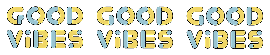
So far, so good. When he started redesigning the actual communication he decided he needed a wide format banner type logo. He started playing with the pieces:
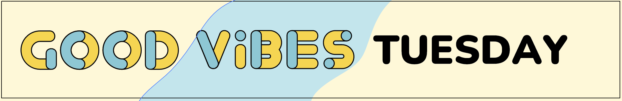
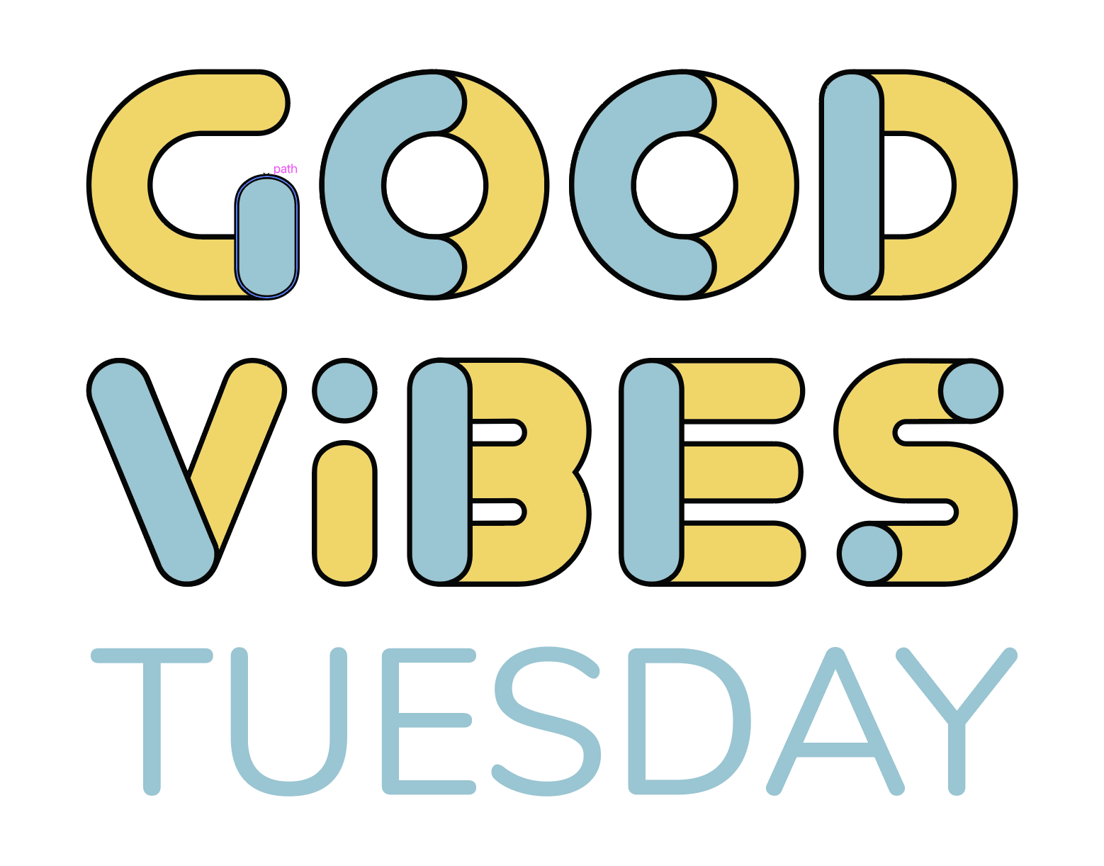
I decided to try a different take and came up with this:
This made him happy. Good Vibes!
The colors are: