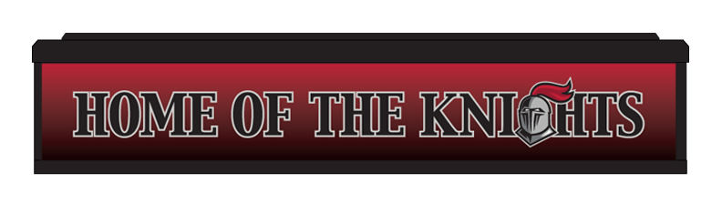
Our school, CCS, needed artwork for the front of the scorer’s table in the new gym. I wasn’t initially asked to do the design, but when they got the design from the manufacturer, they noticed a difference in the font and the spacing and asked me about it.
The cool thing about this is that over the years we have created a culture of awareness about design that enables more people to monitor the brand and ensure that we are maintaining our brand standards.
There were two problems with the submitted design: the wrong font and the wrong spacing.
The “KNIGHTS” was a graphic we provided, as it is a standard mark for athletics. The “HOME OF THE” was text the company created. If you look closely at the “T” in “THE” versus the “T” in “KNIGHTS” you can see the serifs are different. Our title font is Capitals, but in some systems there are variations of this font that don’t match ours. In this case I don’t think they actually used Capitals, but rather something they thought was close.
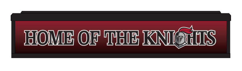
Using the correct font and adjusting the kerning correctly for our design resulted in a much better rendition: