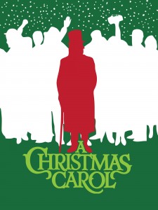
Attending a performance of “A Christmas Carol” is a tradition for may families. So it was no surprise when our school chose to put on a production of the perennial favorite.
I had already created the concepts for all the plays using a consistent look to tie all the plays together with high contrast, 3-4 saturated colors, and bold, monochromatic images.
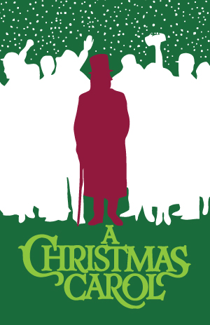
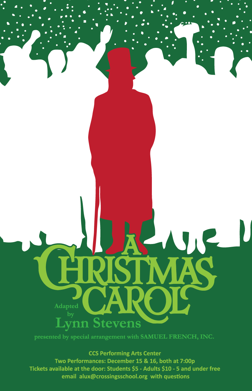
While the concept work is close to what will be needed for a poster, some adjustment is always necessary. Once I was given the required acknowledgements that had to be included, I moved the key elements in the concept up slightly and adjusted the size of the title block to allow for the rest of the information. I changed the red to be more christmasy and added another shade of green to help differentiate the various sets of information.
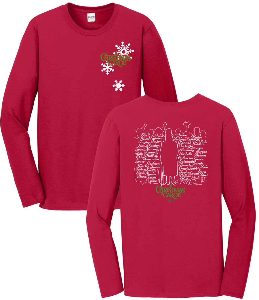
Once the poster was complete I started working on a shirt design. I needed a front pocket design and a full back that included the names of the cast and crew. For the front I thought using snow flakes would give some context and tie into the snow happening on the poster. As I played with what to do with the names for the back I realized we could use the names to create the negative white space in the poster and the shirt color for the silhouette of Scrooge. It wasn’t difficult after that to create both designs with only two colors.
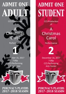
Finally, I needed to create the rest of the collateral for the production, a cover for the playbill which is a resized and reduced version of the poster, and the tickets.
