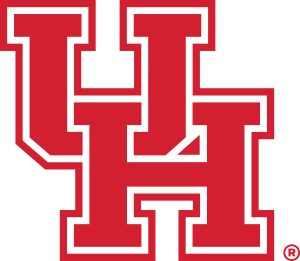
The University of Houston that is. Their interlocking UH logo is wrong. It’s actually very simple.
This is the official logo:

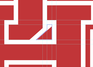
This is how it SHOULD look:

If you simply look at where the white band falls for each letter and fill in the gap you get a different element than they placed in the logo:

Unfortunately, someone was asleep at the switch or just lazy. They should fix it…..
And they have another problem….Oklahoma State 43 – U of Houston 30 on November 18, 2023.
