We love Autism Oklahoma. It is a grassroots organization that supports individuals with autism to reach their full potential, supports families so they can thrive, and supports communities to understand and embrace differences.
They recently chose to go through a rebranding to freshen their brand identity and better represent the community they love and serve. After working with an illustrator who is a friend of Autism Oklahoma they had come to a design they were leaning toward:
After giving some thought to what they were trying to accomplish I suggested some changes to the design:
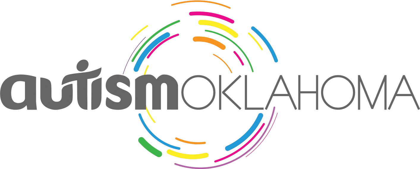
The goal of this rebranding was to move toward a more unifying mark that communicates the values of the community AutismOklahoma serves, while retaining some familiarity. Thinking about support, inclusion, and bridging gaps led to several intentional elements in the new design:
The “autism” word mark maintains the weight and playfulness of the original mark while creating a fresh visual without the puzzle piece elements. The variations within the letter forms draw the eye to the center of the mark where the “t” element represents a person both being supported by, and bridging the gap between, the elements on either side. This represents the value of each person and the value of the community as being equally important. The letterforms are intentionally adjusted to create a sense of energy and completeness that mirrors our community when everyone is welcome and able to participate.
The “OKLAHOMA” is reduced in weight, so it doesn’t interfere with the primary mark, but is still prominent. The font is intentionally plain and straight, with squared off elements, as a support for the word mark.
Finally, the circular elements behind the word mark create a sense of motion that reflects the energy and activity of the community. The primary colors represent the diversity and vibrancy that are reflected in the individual as a part of the collective.
There is a corresponding horizontal alignment also: