Syntrias is a real estate development company a friend of mine is starting. They are connected to two other companies in the commercial real estate space where they provide the construction project planning and delivery to compliment the services of the other two sister companies.
Syntrias is a portmanteau of two Greek words: Syndeo meaning connection and Trias meaning trinity or three. So, Syntrias, by name and mission, provides construction project planning and delivery in compliment to Connect and Trinity, its sister companies.
My friend asked me to create a brand for his new venture. I said yes.
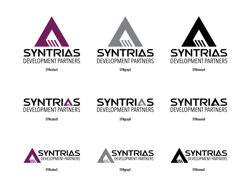
The other two companies have logos based on triangles so he wanted to carry that element along, but differentiate his company at the same time.
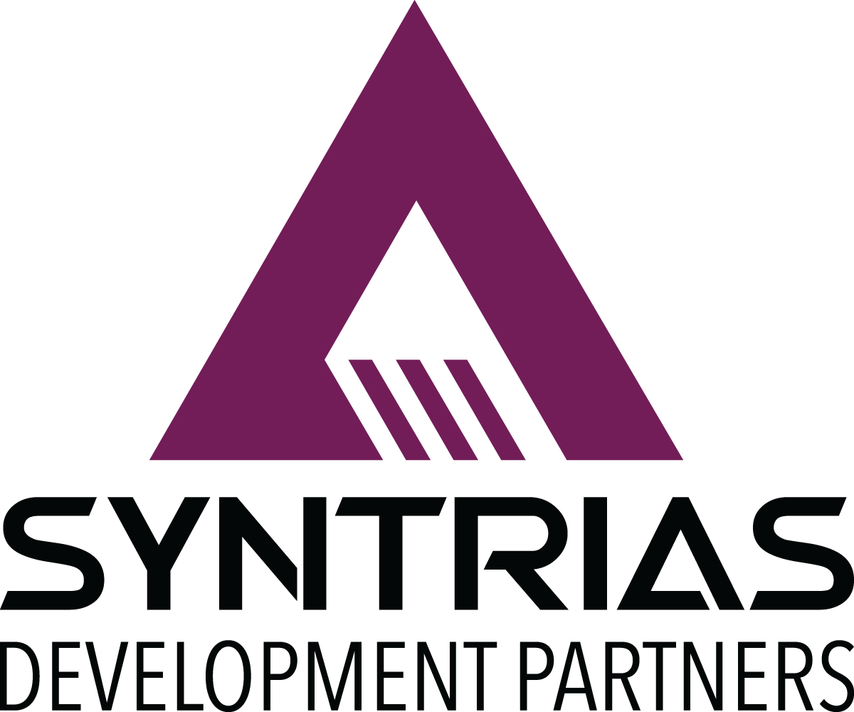
We tried on some different ideas but this one was the best by far:
I also developed two horizontal options:
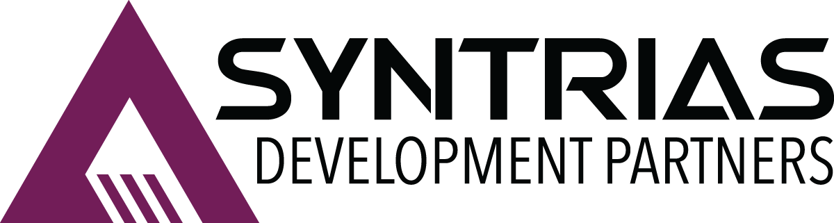
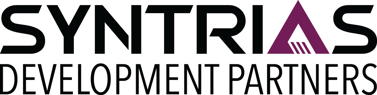
We really struggled with the purple. Purple is a difficult color to use in branding. It needs to be dark enough to be serious without going to black, and it needs a little yellow in it so it isn’t lavender but not too much or it starts looking brown. We settled on Hex: 721c58, RBG: 114,28,88, CMYK: 54, 100, 35, 24 and called it Eggplant.
The word mark, SYNTRIAS, is based on the font Swera. The word mark was altered from the original font forms and therefore the word mark cannot be recreated using the font and we are discouraging the use of the font anywhere else.
The modifying mark, DEVELOPMENT PARTNERS, uses Avenir Next Condensed Regular unmodified. While this font may be used, it is discouraged.