A friend of mine, who is a phenomenal photographer, is putting together a group to handle a broader range of visual needs for clients. They intend to handle video, still photography, audio, and other related collateral for a variety of projects.
The name they are using is Dynamic Visual Productions and they asked me to create a brand for them.
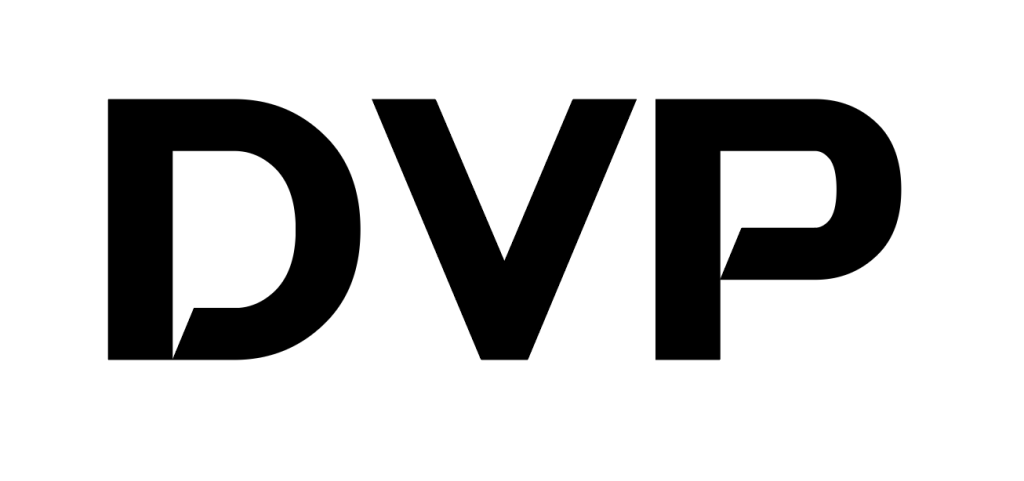
I started with the name and the first letters of the name. The first thing that I noticed was the “d” and “p” in most fonts are functionally, if not exactly, the same, just rotated 180°. So, I started with d v p in a font called Swera because I like the way the bottom of the loop of the “P” just kisses the descender.
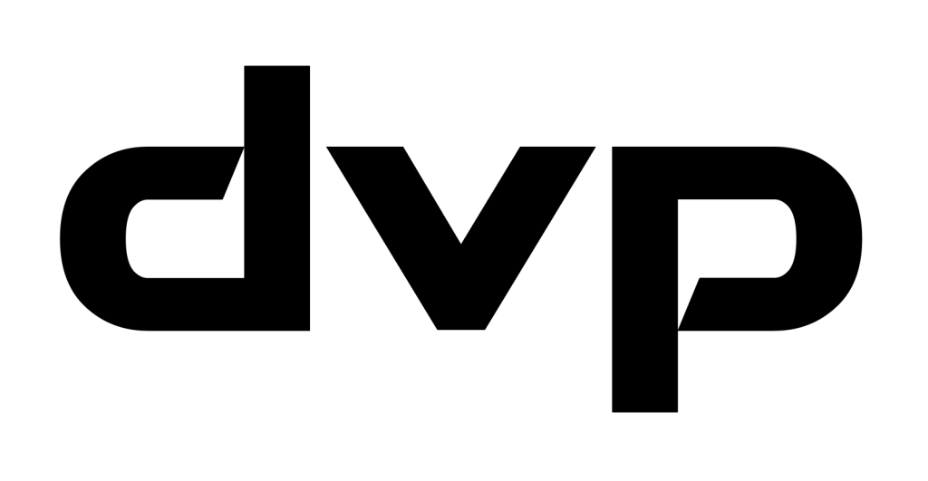
Unfortunately, the demo of Swera I have only includes capitals so I used the P rotated 180° for the d and then altered the V so the x-height was correct without diminishing the stroke.
I felt this had a great symmetry to it. However, the logo needed more to really represent the group and set it apart. I played with a few concepts but felt that film (think 35mm SLR) was both representative and graphically cool. I found some images of a 35mm strip of negatives to get the dimensions right and started playing. Eventually this was the result:
I liked where this was going but didn’t feel like it was finished. I went back to the actual images of film and using photoshop I created “real” film with the exact dimensions and hole placements of my logo “film”.
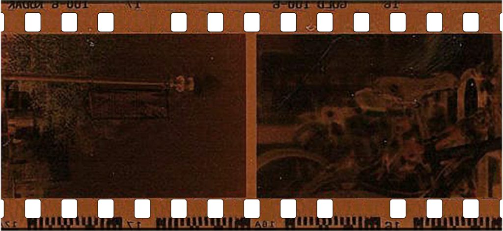
However, I didn’t like the fact that the images were random (and not related my friend at all) so a lot more photo shop and these:

Became this:
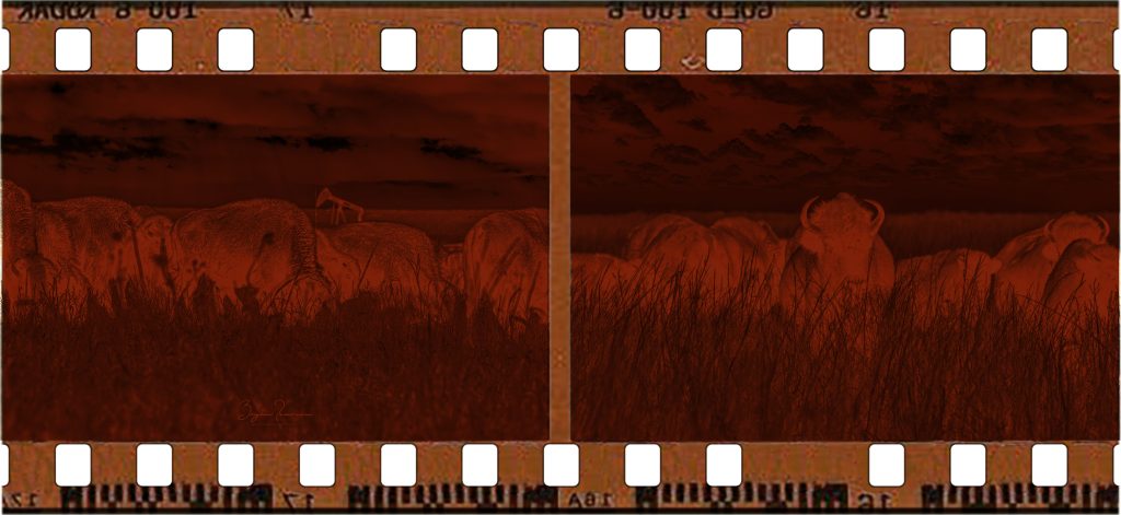
Some color adjustment and tweaking gives us the final product with a simplified 2 color version and a monochrome version:
