
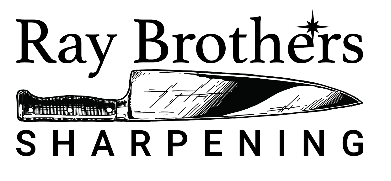
A friend of my son was opening a knife and scissor sharpening service. My son was helping them come up with a visual identity and asked me to help. This is where they were when I got involved:
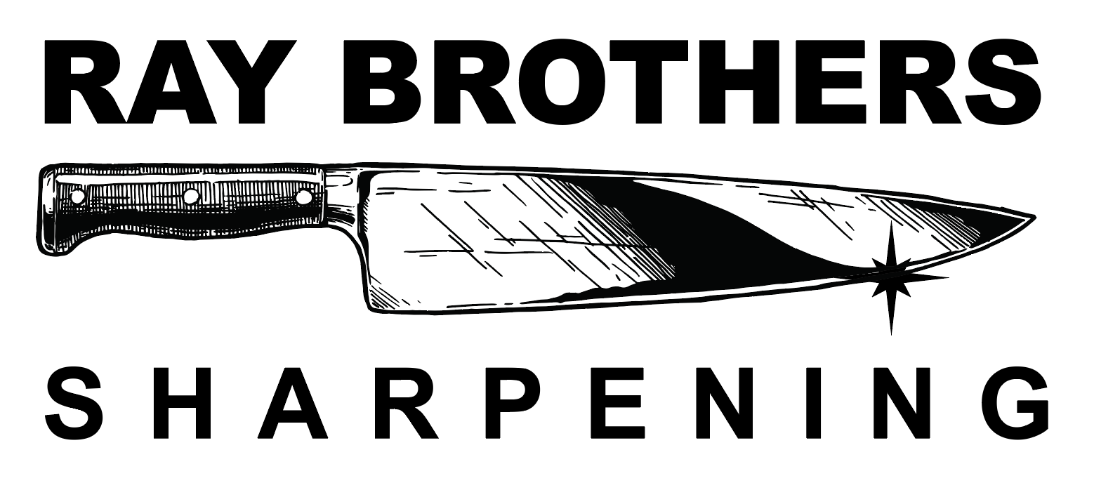
My starting point was to make the elements they already had make a little more sense. THe star burst element didn’t seem to be anchored to anything and while the knie being blade up gave the descender of the Y a place to go, it broke up the sight lines and weakened the main lettering. By going all caps and flipping the knife , then using the star burst element to imply a sharp edge, we strengthened the visual.
When they saw this version they made a couple new choices. They wanted to go cleaner and simpler on the knife element and they wanted the serif font for the title, leading to this quick draft:
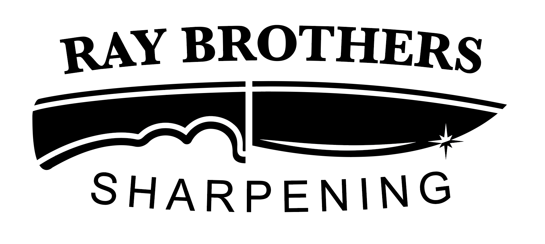
They really liked this idea so I worked on cleaning and improving it to reach the final version:
