
A friend recently acquired the Edmond location of a local bicycle store. Al’s Bicycles has been around for over 45 years and currently has 3 locations which are independently owned, but operate in a co-op for purposes of online presence, name, and some other promotional areas. My friend ask me to help him update the graphics being used at his store.
Al Webb (1 man) founded Al’s Bicycles (2 wheels) and now my friend whose name is another word for 3 is set to carry on the tradition. Tradition is important. Brand is important. The Al’s Bicycle brand stands for integrity, reliability (free adjustments for life), and family friendly healthy activity. When Al’s was started, graphic design was still being done with pencils, pens, and velum. Hence the vintage look of the “original” Al’s logo:
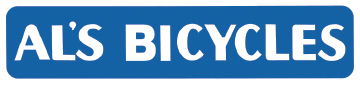
I was unable to find a font that matches this logo. Apparently, other people had a hard time too and at some point they started using a “close” font to recreate this word mark:
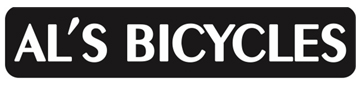
I decided to recreate the original with all the unique parts, the rounded top of the A, the ratio of the vertical and horizontal stroles, etc., but with better balance (so the BI doesn’t scream at you…)

My friend was very pleased. Next I took a graphic that is used in the store and updated it. For some reason the wheel on the old logo wasn’t even centered on the hub, old style word mark, too much space above and below word mark, and decided to upgrade the location too:
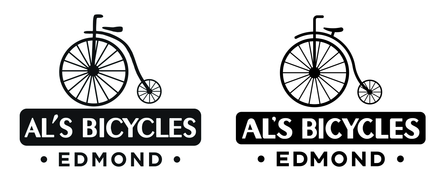
The old style bike is called a “penny farthing” and makes a cool graphic brand for the bike store since it is a very recognizable “bike” but does not mimic any current style. Since the bike store carries and sells so many different kinds of bikes, using a bike that isn’t sold works.
Every bike that is sold gets a “sticker” put on it to identify it as a “Al’s” bike and to remind the owner where to go for service or their next purchase. The current sticker was a little anemic so a new design for that was next:
The new design plays on the old metal badges on bikes that signified the manufacturer. The “label” should be made on aluminum “foil” that has some thickness so it feels like a badge.
Swag is an important part of a lifestyle retail business. Stickers, shirts, hats, and other items that are branded, cool, and take-home worthy. The next step is to create options for branding swag:


