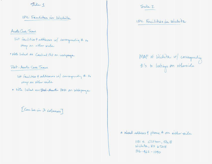
A friend ask me to lay out a locator card for providers to carry in their pockets to give to patients so they could transition from one facility to another. He sent me a scan of a handwritten page describing what he wanted:

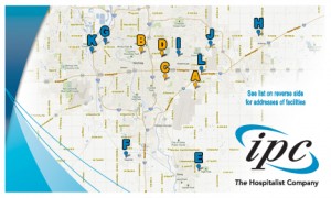
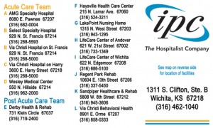
I love these kinds of jobs. Tell me what you want to accomplish and let me come up with a way to do it. He sent me a style guide so I had access to vector logos and accurate colors. He also gave me the link to a web based map that I ended up basing the map side of the card on. After some back and forth and a few edits we are both happy with the final product:
  |
The thing about a project like this is that it is not cutting edge design, not even very original from a concept standpoint. However, it is the kind of design that is executed millions of times a day. Doing this kind of thing well makes everything a little better, doing it poorly makes the world a less beautiful place. I hope I did it well.
