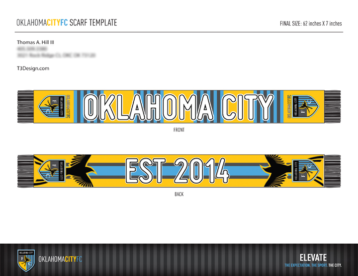
The Oklahoma City FC has officially opened shop and promises to bring a top tier soccer oasis to waiting fans in this midwestern desert. I’m not really a sports fan. Soccer is fine. Watching soccer in a bar in Mexico City is awesome. I will withhold judgement on OKC soccer until it has had time to mature. I wasn’t an NBA fan either but now find myself inexplicably drawn to Thunder Basketball…
When they announced a design contest for the inaugural soccer scarf (I have to admit I had no idea that the “scarf” was such a sacred part of football fandom) I decided I could get on THAT wagon.
Rules are simple: one design per person (which is the way it should be), have to use the elements of the logo and word mark, maximum of five colors (there are four colors in the team color scheme). Oh, and you have to sign away every single right to any design you submit forever and ever amen.
Not being familiar with soccer scarves, I decided to do a little research to see what was “fashionable” and was not surprised to find that like all design there is a lot of variation. I chose to approach the design from an old school view with just a little modern thrown in for good measure.
I might add here that the people putting on the contest frustrate designers by failing to designate the font being used in the design, providing only low res versions of logos and word marks and not specifying minimum line weights and color separations based on production technique. It is highly likely that some designs will be rejected for considerations that could/would have been avoided if we knew more.
All that said, here is my design (already submitted and signed in case you get any ideas about copying…)

10 minutes after I submitted my design I got this back:

