Author Archives: Thomas Hill

Visualization

A friend of mine, who is a phenomenal photographer, is putting together a group to handle a broader range of visual needs for clients. They intend to handle video, still photography, audio, and other related collateral for a variety of projects.

The name they are using is Dynamic Visual Productions and they asked me to create a brand for them.

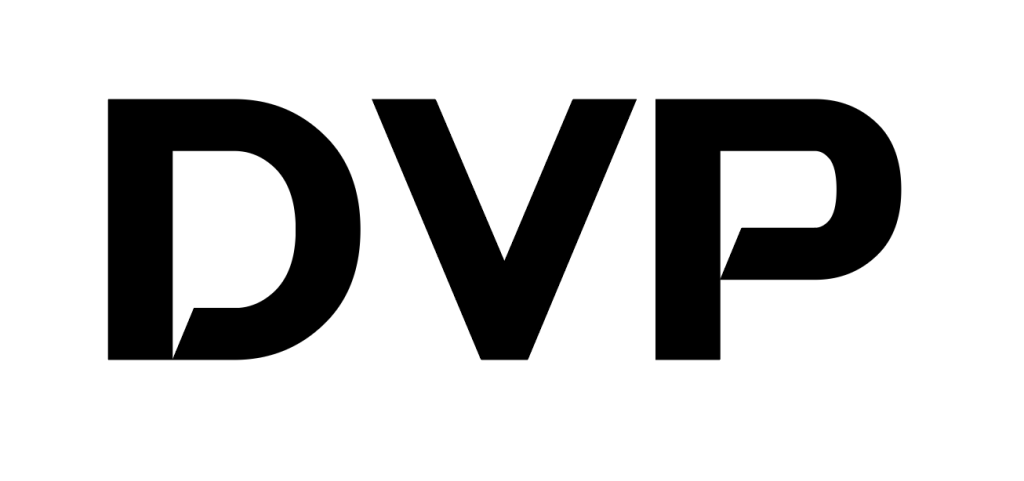
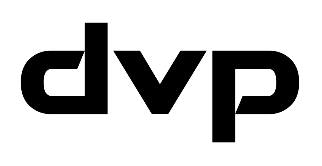
I started with the name and the first letters of the name. The first thing that I noticed was the “d” and “p” in most fonts are functionally, if not exactly, the same, just rotated 180°. So, I started with d v p in a font called Swera because I like the way the bottom of the loop of the “P” just kisses the descender.

Unfortunately, the demo of Swera I have only includes capitals so I used the P rotated 180° for the d and then altered the V so the x-height was correct without diminishing the stroke.

I felt this had a great symmetry to it. However, the logo needed more to really represent the group and set it apart. I played with a few concepts but felt that film (think 35mm SLR) was both representative and graphically cool. I found some images of a 35mm strip of negatives to get the dimensions right and started playing. Eventually this was the result:

I liked where this was going but didn’t feel like it was finished. I went back to the actual images of film and using photoshop I created “real” film with the exact dimensions and hole placements of my logo “film”.

However, I didn’t like the fact that the images were random (and not related my friend at all) so a lot more photo shop and these:

Became this:

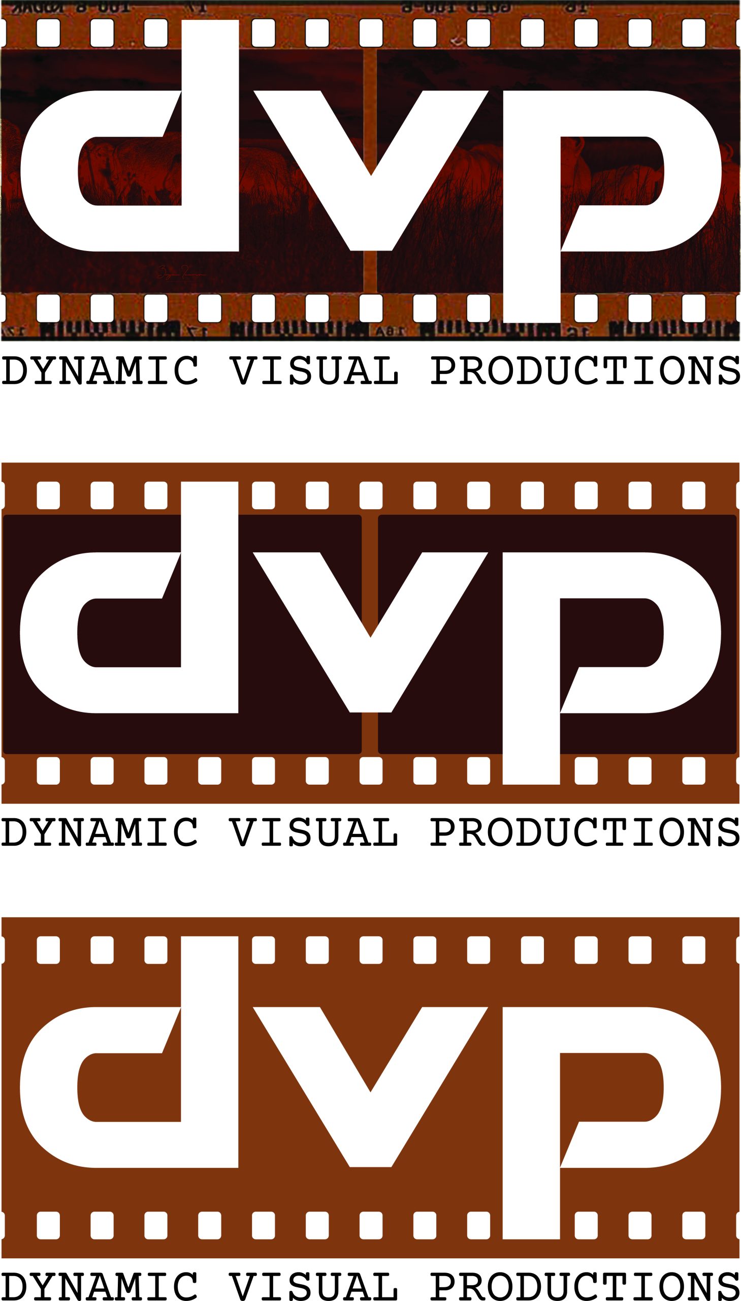
Some color adjustment and tweaking gives us the final product with a simplified 2 color version and a monochrome version:

Circuitry

One of my sons is starting a business. I think that is great. His goals are to make some extra money doing things he loves doing (and already does often for free) and to get real world experience in running a small business. He asked me a lot of questions, but he also asked me to design a logo.

The business is computer repair and building. The kind of computers that gamers and programmers use. I thought I would use a computer processor chip and circuit board traces in the design. I played around a little and a design started forming.

It took some forethought and planning to get the letter connection points and the chip connection pads to work. Overall, the design works and my son is very happy with it.

Synthesis

Syntrias is a real estate development company a friend of mine is starting. They are connected to two other companies in the commercial real estate space where they provide the construction project planning and delivery to compliment the services of the other two sister companies.

Syntrias is a portmanteau of two Greek words: Syndeo meaning connection and Trias meaning trinity or three. So, Syntrias, by name and mission, provides construction project planning and delivery in compliment to Connect and Trinity, its sister companies.

My friend asked me to create a brand for his new venture. I said yes.

The other two companies have logos based on triangles so he wanted to carry that element along, but differentiate his company at the same time.

We tried on some different ideas but this one was the best by far:

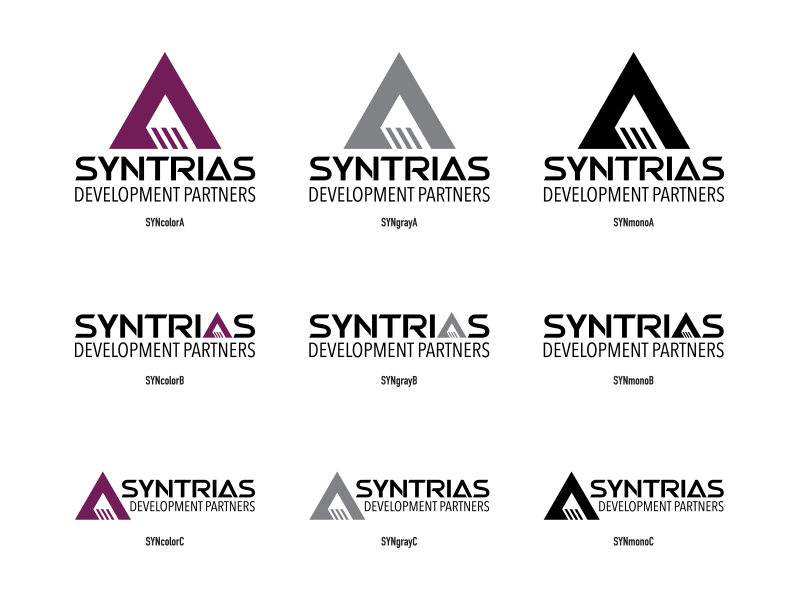
I also developed two horizontal options:

We really struggled with the purple. Purple is a difficult color to use in branding. It needs to be dark enough to be serious without going to black, and it needs a little yellow in it so it isn’t lavender but not too much or it starts looking brown. We settled on Hex: 721c58, RBG: 114,28,88, CMYK: 54, 100, 35, 24 and called it Eggplant.

The word mark, SYNTRIAS, is based on the font Swera. The word mark was altered from the original font forms and therefore the word mark cannot be recreated using the font and we are discouraging the use of the font anywhere else.

The modifying mark, DEVELOPMENT PARTNERS, uses Avenir Next Condensed Regular unmodified. While this font may be used, it is discouraged.

Here Comes The Boom

I love to blow things up. The best opportunity I get every year is Fourth of July. We put on a great fireworks show every year. We use an electronic ignition system and this year we fired off 244 two inch mortars and about 100 cake items. Our current system has 32 channels, which means we have to fuse together multiple items for each channel and then “hope” the fusing works and we have estimated the timing correctly.

Next year will be different. We are moving to a new system which has 144 channels and we are getting new mortar tube racks and adding tubes to bring our total to 324. The new control system uses a distributed set of controllers that need to be in cases to protect them from the elements and the fall out from the fireworks.

I could buy cases, but I could also 3D print them. Or more accurately, have the sons of one of my executive team members print them for me. I have worked with these young men off and on over the years on engineering fair projects and side projects. They are very smart, very curious, and very self motivated. One of them recently built a flame thrower, so they also share a love for blowing up and or burning things.

If you’re going to make your own stuff, you should have a brand and go all the way. When I printed out the word “PYROTECH” I noticed the TE which I could make a T3 and the word would still be readable. It’s actually amazing how adaptive our minds are in recognizing familiar words even if they are messed up.

Once I had a word mark I realized I could add this to the mortar racks and the fuel mines tubes easily with a stencil. We would paint everything black and then stencil the word mark on in orange. That meant I needed to create a stencil which requires cutting the letters into sections so the insides are anchored and there are no parts that can lift and allow paint to get underneath.

While creating the stencil I ended up adjusting the original because I liked some of the letter form changes that made the stencil look and work better:

A Spectrum of Design

We love Autism Oklahoma. It is a grassroots organization that supports individuals with autism to reach their full potential, supports families so they can thrive, and supports communities to understand and embrace differences.

They recently chose to go through a rebranding to freshen their brand identity and better represent the community they love and serve. After working with an illustrator who is a friend of Autism Oklahoma they had come to a design they were leaning toward:

After giving some thought to what they were trying to accomplish I suggested some changes to the design:

The goal of this rebranding was to move toward a more unifying mark that communicates the values of the community AutismOklahoma serves, while retaining some familiarity. Thinking about support, inclusion, and bridging gaps led to several intentional elements in the new design:

The “autism” word mark maintains the weight and playfulness of the original mark while creating a fresh visual without the puzzle piece elements. The variations within the letter forms draw the eye to the center of the mark where the “t” element represents a person both being supported by, and bridging the gap between, the elements on either side. This represents the value of each person and the value of the community as being equally important. The letterforms are intentionally adjusted to create a sense of energy and completeness that mirrors our community when everyone is welcome and able to participate.

The “OKLAHOMA” is reduced in weight, so it doesn’t interfere with the primary mark, but is still prominent. The font is intentionally plain and straight, with squared off elements, as a support for the word mark.

Finally, the circular elements behind the word mark create a sense of motion that reflects the energy and activity of the community. The primary colors represent the diversity and vibrancy that are reflected in the individual as a part of the collective.

There is a corresponding horizontal alignment also:

Highway to Health

I’m heavily involved in an organization that radically changes the lives of drug addicts, alcoholics, and those that love them. Started over 10 years ago with a single sober living home, HIA has grown into a comprehensive life recovery program being lived out in two dozen homes in 12 different cities, as well as Finding Hope groups across the US.

The next step to creating the highway to health is a treatment center. Called The Healing Center, this new phase of HIA will provide an in-patient recovery program as the first step before joining the community in a sober living home. Future growth will include IOP care, and follow-on therapy.

So, when the founder and CEO sent me the concept for The Healing Center logo I could help myself and offered some suggestions.

The original is on the top. My adjusted logo is on the bottom. First I increased the weight of the font forms in “THE” without changing the scale of the letters to match the weight of “CENTER”. I adjusted the spacing between the words, then I matched the width of the gold horizontal elements to the weight of the secondary lettering and created a formed end where they interact with a letter. Minor changes really, but they improve the look significantly.

I did the same things to a vertical version. The original is on the left, mine on the right:

Belle on Wheels

A friend of mine has a niece that is paralyzed from the waist down, meaning she is in a wheel chair. This is a tragedy, but she doesn’t act tragic at all. She is fiery, determined, self-reliant, and is currently completing her degree in engineering.

Her family wanted to surprise her with a t-shirt that embodied her spirit. They had the idea to have a girl with flowing hair in a wheelchair with the text “Belle on Wheels” in script. They sent me these screen grabs from someone’s phone along with this text “The wheelchair person needs to be a girl – flowing long hair…she also likes the wheelchair icon that is more in motion, like this:”

They also noted that the girl needed to be, well: “also clearly a girl – boobs, but not Hooters boobs…”

I started playing the the wheel chair icon and after several versions arrived at this:

I found several fonts and let them pick one they liked:

When combined and placed on a blue background:

Elemental Prayer

I was invited to sit on the dias at the CBMC Metro Prayer Breakfast this year. Since I wear a graphic tee under a sport coat with jeans and tennis shoes, I thought I should have a special shirt for the occasion.

Since it is a Prayer breakfast, I wanted a shirt that said “PRAY”. The verse in the Bible that talks about praying without ceasing is 1 Thessalonians 5:17. 1 Thessalonians is the 13th book in the New Testament. So with three words, “pray without ceasing”, and three numbers, 13, 5, and 17, I saw an opportunity to use the periodic table format in a design.

Blossoming Brand

One of my dear friends is a fabulous artist. Farooq Karim makes the most magical pieces from paper. He hand cuts thousands of individual pieces of paper then combines them into individual flowerettes. Then he arranges hundreds of the small flowers into a larger dynamic blossom. All his pieces are the (fill in the blank) Blossom.

I have several pieces of his work in my personal collection and many more in the Kimray Visual Arts Collection.

So, when Farooq asked me to help him create a brand to represent himself I was excited to get to work on something so personal for someone I respect so much.

At first I tried to incorporate Farooq’s art into the concept. I had done other work with Farooq and had used the forms from some of the art pieces in other designs. I also had digitized and cleaned up his very unique signature:

However, the more I tried to work with the familiar forms, the more it didn’t feel right. I started to realize that the brand needed to represent Farooq, not just in the art form he was currently producing. Farooq is an artist in a much wider way. He practices the art of generosity of human experience. Farooq is a true renaissance man. He is profoundly kind and generous. I can’t imagine there is anyone who knows him who does not like and respect him. So, he needed a mark that was him, not just a single component of him.

I started playing with his name, his signature, his initials, and before long the brand emerged:

Pete’s

Over the holidays my sons and I (mostly them) got everything running on my MAME Arcade Cabinet. MAME stands for Multiple Arcade Machine Emulator. The software emulates the old computer hardware that played the arcade games and uses copies of the original hex code that was stored on EPROMS on those computer boards.

Buttons, joysticks, spinners, and trackballs are all wired into specialized controller cards that convert those signals into what appears to the emulator as keyboard and mouse signals. When it’s all done correctly you can’t really tell that you are not playing the original game on original hardware.

In the process of getting my cab back in shape, one of my sons decided he would like to build a cab for himself. I always wanted to build a second cab, so I was all in. The first step was to determine what kind (shape) of cab to build. I suggested he consider the old TAITO cab. For one thing, I had one in storage that we could use for measurements and possibly parts, and two, I think it is one of the cleanest and well designed cab shapes. He agreed and we were off to the races.

He wanted an OSU Cowboys theme, but not like my cab. I found some reasonably high res images of the original art for this cabinet, as well as a good set of plans for building one.

I digitized the side art and used that as a starting point for the design:

While I was working on graphics, my son was busy modeling the entire cabinet (including every bolt and nut) in Solidworks for we would have a model:

Along the way I also digitized the TAITO logo and a graphic from another cab for use in the Attract Mode Screen. This was the pic I got off the cab:

And the Redrawn art:

I also took the TAITO Logo:

And made it a “PETES” logo:

And then used those elements on the Attract Mode screen:

And the Marquee:

Poking The Cowboys

I recently posted about a graphic design error in the University of Houston’s interlocking UH logo. Lest you think I am biased and ignore problems in my own backyard:

There is a problem with the Oklahoma State University logo too. Here is the official logo:

Notice the difference in the treatment of the path offset between the two circled areas:

This is how it SHOULD have been done:

Instead of notching the space between the “O” and the “S”, they could have not notched the space between the “S” and the “U”:

However, if you do that you are setting the expectation that in the black offset outline there is no indention, so you really have to remove the notch between the bottom left corner of the “O” and the tail of the “S”. Like this:

I like the notches best, but they should be consistent. GO POKES!