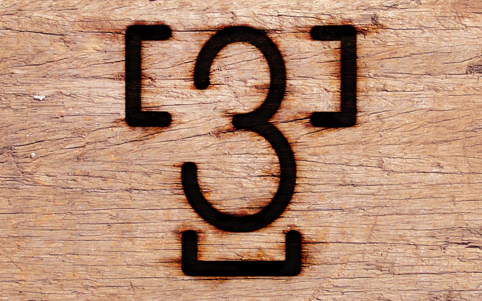
I developed a brand for a friend and in the process I learned about the sizes, widths of elements and the way a brand must be constructed so that steam can escape and you get a good scar. All a little gross in one sense, but fascinating also.
That led me to design a “brand” for the T3 logo. It had to be constructed of thin elements without any enclosed space. The original form of the logo is too complex for a brand and creates 3 enclosed areas. To eliminate those areas, and simplify the brand, I approximated the “T” element by defining the three ends. This also highlights the interesting fact that there ARE 3 “ends” in a sanserif “T”. The 3 needed to be a single line so I took the center line of the 3. This produces a readable and brandable mark. I had fun both coming up the the T3 brand and with photoshopping it onto some wood.
