
Another unsolicited (and unappreciated, and unpaid) redesign.
Lindon Leader, the man behind the FedEx logo design:

said, “I strive for two things in design: simplicity and clarity. Great design is born of those two things.” I couldn’t agree more. So when I see design that is unnecessarily complicated, I can’t help but re-imagine what could have been.
A friend of mine noticed something the other day that I noticed long ago. The logo for Lowe’s uses a different font for the “s”.
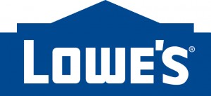
The primary font is at least based on, if not actually, a font family called “Design System” and is probably the family member called “A 900.” The “s” is not. If the designer had a reason for this, it is not apparent, and that is the problem. To make the logo more complex (two fonts instead of one) required that there be a easily discernible reason. Without a clear reason to deviate from the simplest approach, the design is less great.
With this one, the redesign isn’t even difficult:
Replacing the odd font “s” with the same font used in the main body of the logo gives the whole graphic a unified and clean (read simple and clear) design. Your mind is not asking “why is that S a different font?” and not getting an answer.
Lowe’s is welcome to use my redesign for free, though I doubt they will.