Even though my daughter is no longer involved in the performing arts at her school, I still have two sons going there, so I agreed to do the design and printing of the collateral for this year’s plays.
The first performance this season will be a special production of the “The Thin Man.” The Thin Man is a 1934 American comedy-mystery film directed by W. S. Van Dyke and based on the novel of the same name by Dashiell Hammett. The film stars William Powell and Myrna Loy as Nick and Nora Charles; Nick is a hard-drinking, retired private detective, and Nora is a wealthy heiress. Their wire-haired fox terrier Asta is played by canine actor Skippy.
The film’s screenplay was written by Albert Hackett and Frances Goodrich, a married couple. In 1934, the film was nominated for the Academy Award for Best Picture. The titular “Thin Man” is not Nick Charles, but the man Charles is initially hired to find – Clyde Wynant (part way through the film, Charles describes Wynant as a “thin man with white hair”). The “Thin Man” moniker was thought by many viewers to refer to Nick Charles and, after a time, it was used in the titles of sequels as if referring to Charles. The film was such a success that it spawned five sequels. The Thin Man was also dramatized as a radio play on an hour-long broadcast of Lux Radio Theater on June 8, 1936. William Powell, Myrna Loy, Minna Gombell, Porter Hall, William Henry, and Thomas Jackson reprised their film roles, and W. S. Van Dyke was host.
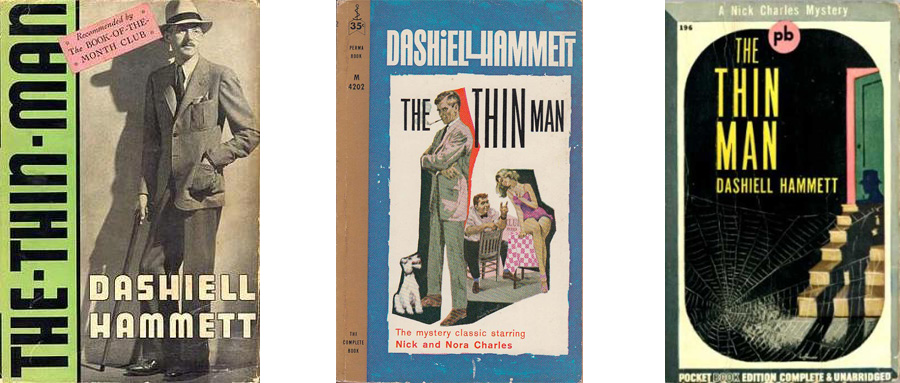
To get a sense for a concept I looked at the covers of the Dashiell Hammett novel:
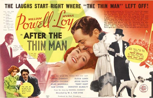
and at the collateral for the movie, like this:
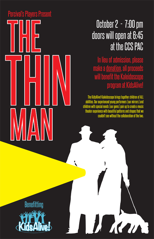
I decide to use a silhouette of a man and woman with a dog (Asta is a wire-haired fox terrier.) Once i had that image ready I played with shadows and other ways to create the suspense of the story, but what ended up working best was a flashlight beam and a black background.
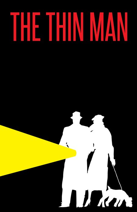
When I showed the concept to the director she said it reminded her “of the old school Dashiell Hammet designs.” Which was exactly what I was going for. I then started adding the necessary information to the poster design.
Going from concept to actual poster (and FB graphic, and PlayBill cover and t-shirt design) often requires adjusting the concept. Once I had all the info on the poster it felt like I needed to shift the title text in order to keep it as the primary focus. I moved the title to the left and stacked it, including changing the size of the three different parts and shifting both the word alignment and the kerning. Then I put a stroke on it to pull it farther up in hierarchy. I stacked the info on the right and used color, size and layout to give each piece it’s appropriate level of focus.
Finally, the play will benefit a program for special needs kids, so I digitized their logo and included that too.