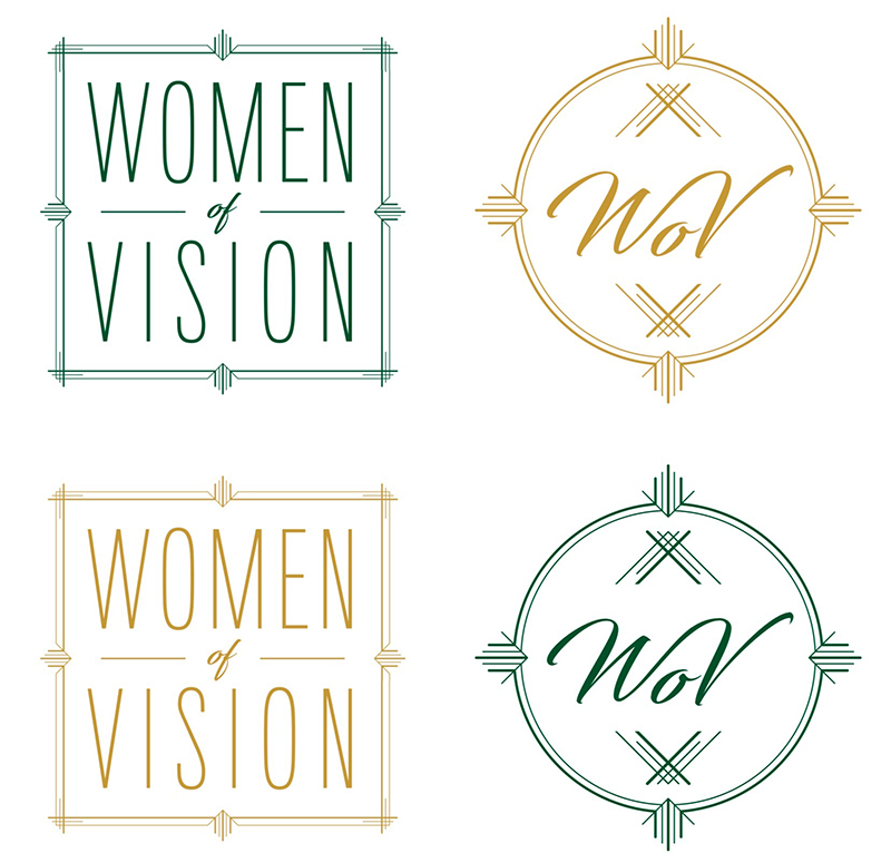
I was recently given the opportunity to help rebrand the Women of Vision at Oklahoma Baptist University. This was the current branding:
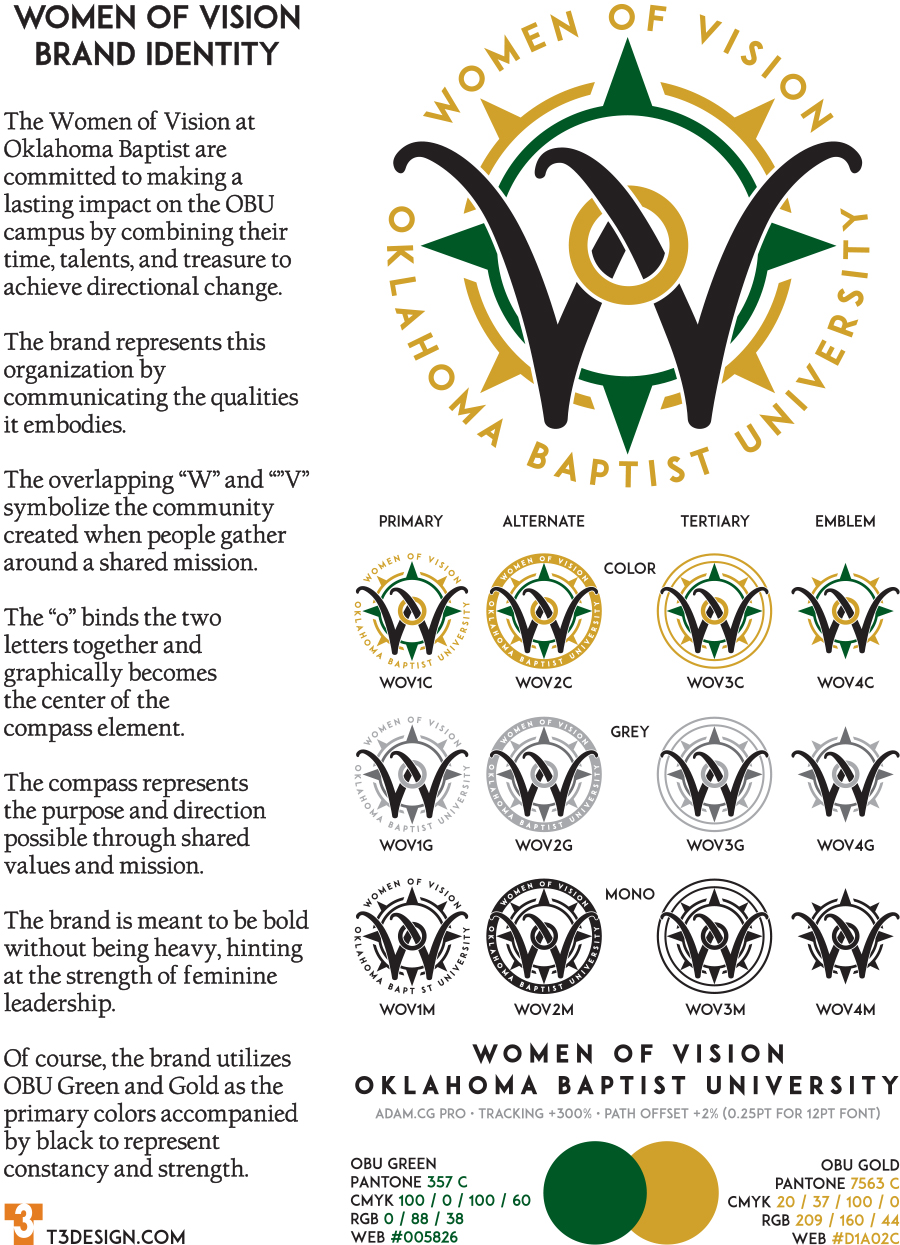
The women were looking for something bolder and more representative of the values, mission, and vision of the group. I immediately thought of overlapping the “W” and the “V”. I also needed an element to ground the text based components and symbolize directional change. I created a compass element and began to play with ways to incorporate the WV element and this was the result. I also created an alternate mark with a solid ring for the text, a tertiary mark with no text, and an emblem which is the WV and compass alone.