A friend I have done design work for before called me recently about a new business venture. He said he was starting a company to do dry ice blast cleaning. The name of the company is Cryo Precision Clean.
He said he want to use blue colors and ice or snow. Other than that, he didn’t have a lot of ideas. I told him I would think about it and see what came to mind.
The idea of a service company made me think about the retro logos from service companies from the 50’s and 60’s. They were clean, simple and single colors, a little campy, and gave off that “logo on the door of a truck” vibe. They were almost always embroidered on the service people’s uniforms.
I found some fonts I liked, an “Icy” text: CF Grand Nord Regular, and a “Script” text: Bulletto Killa. I started with playing with the initials and the spelled out name:
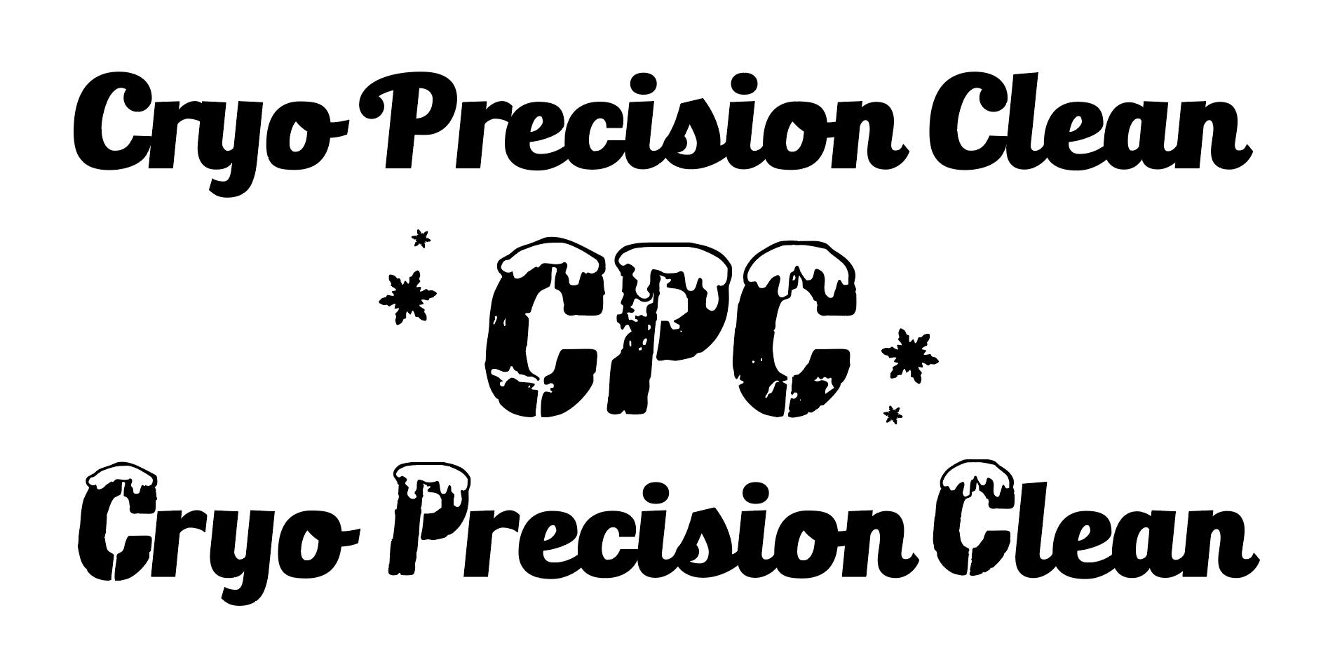
I liked the direction but felt the Icy text was too complicated and there were things about the script I didn’t like, especially the lower case “y” and the way the “n” ended. So I took out the “extra” stuff in the initials, edited the snow on one “C” (I actually used the “O” and created a “C” from it. Then I borrowed a “y” letterform from another font to get a better descender and cleaned up the connectors on all the letters and the ends of the “n”.
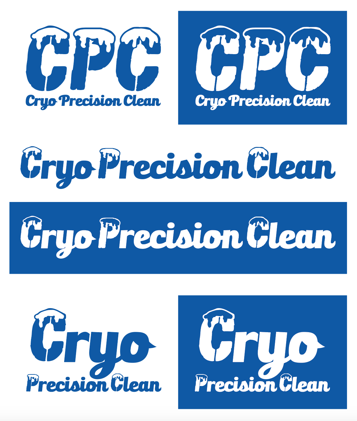
I also changed the “C” for the usage where the name is spelled out under the initials because repeating the “icy” letters wasn’t an option. The result was a letter logo that can be used with or without sub-text, a textual logo, and a vertically oriented textual logo amplifying the “Cryo”.
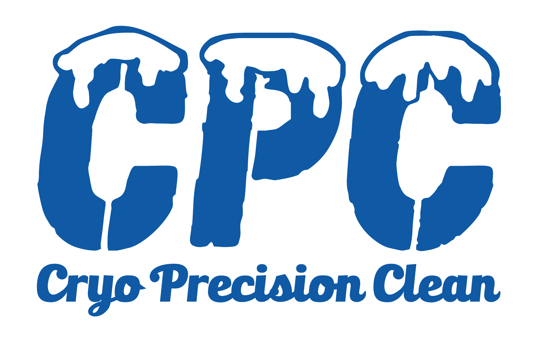
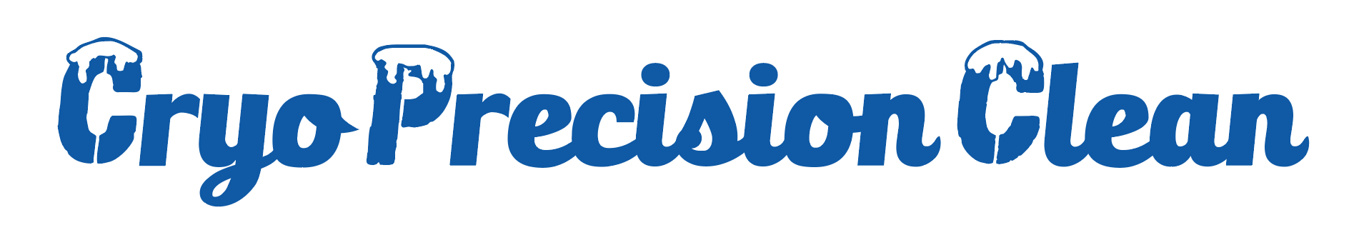
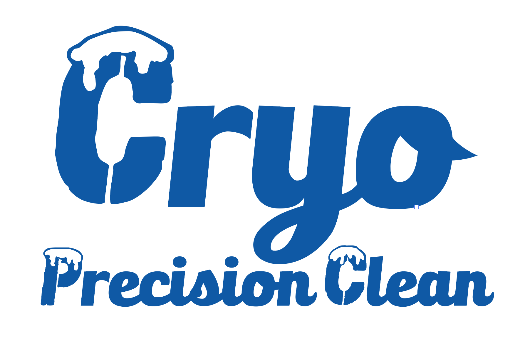
The logos work in positive or negative single color. The blue is CMYK 100,70,0,0.