
I recently posted about a graphic design error in the University of Houston’s interlocking UH logo. Lest you think I am biased and ignore problems in my own backyard:
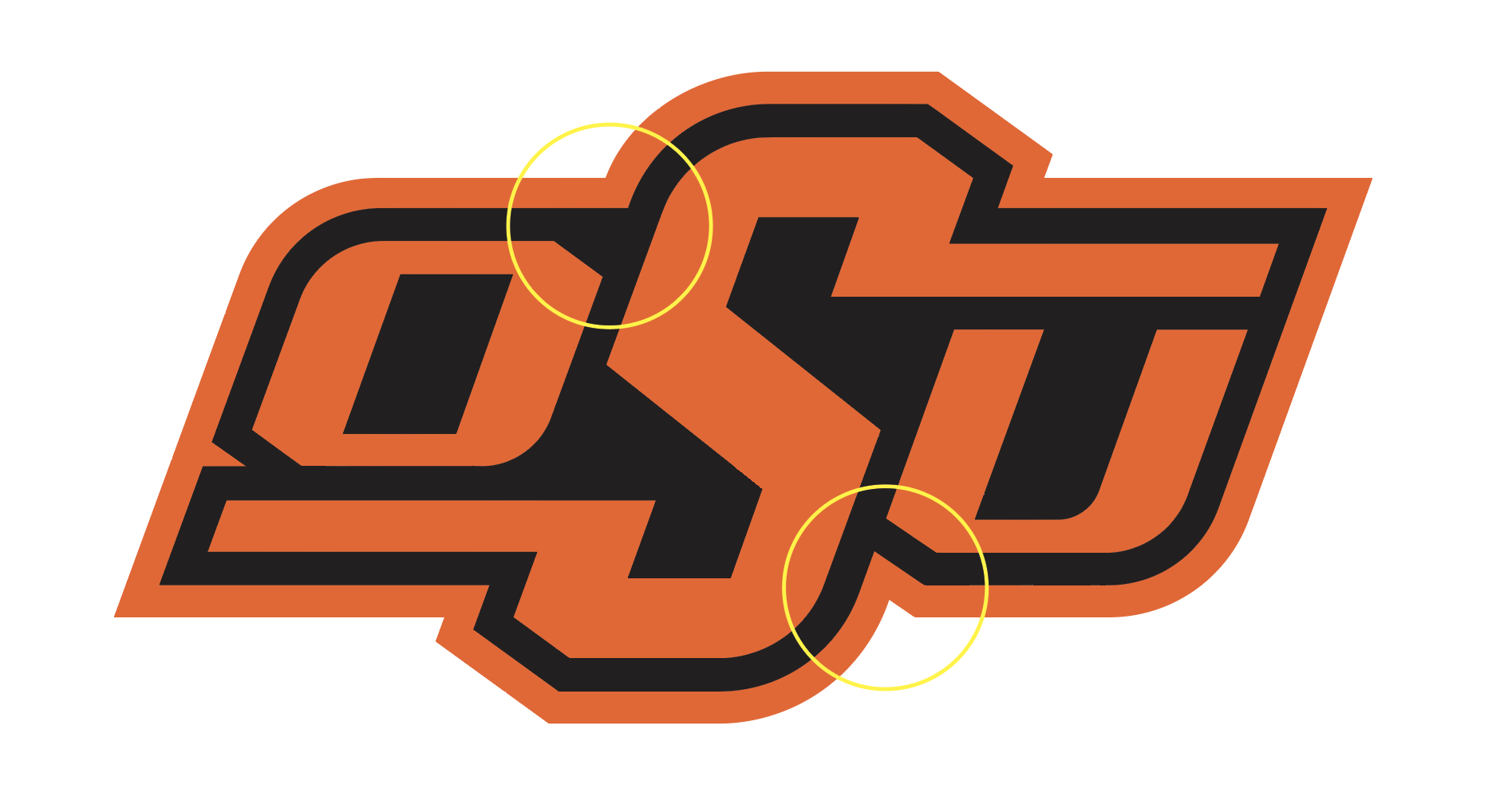
There is a problem with the Oklahoma State University logo too. Here is the official logo:
Notice the difference in the treatment of the path offset between the two circled areas:
This is how it SHOULD have been done:

Instead of notching the space between the “O” and the “S”, they could have not notched the space between the “S” and the “U”:

However, if you do that you are setting the expectation that in the black offset outline there is no indention, so you really have to remove the notch between the bottom left corner of the “O” and the tail of the “S”. Like this:

I like the notches best, but they should be consistent. GO POKES!